Flowchart
Overview and Key Concepts
There are many different Flowchart objects available in the Process Flow Library. You can use these shapes to build a classic flowchart in your process flow. You can also use them as visual containers that help organize, encapsulate, and visualize the activities in your process flow.
When process flow activities are inside a flowchart container, they will move when the container is moved, as shown in the following animated image:
You can also set the Flowchart object so that the activities disappear when you zoom out from the model. For example, in the following animated image, the flowchart objects are set to hide contents when the process flow is zoomed out by 75%:
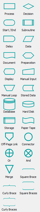
The Process Flow library has many different shapes available, including standard flowchart shapes:
Connectors
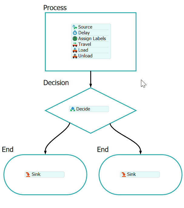
As shown in the animations above, flowchart objects can also be connected together using standard connectors. When flowchart containers have activities placed inside them, their connectors may include logic for determining token flow into and out of activities contained by the flowchart containers.
Connectors Into a Flowchart Container
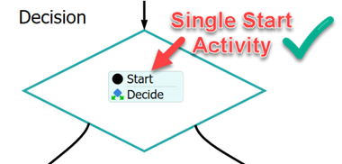
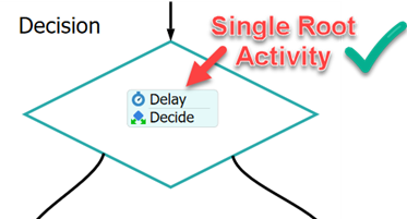
When a flowchart container includes activity connectors directed into it, the container uses the following set of rules to determine which activity inside the container should be started when a token is sent through that connector.
- If you have defined the object's Start Activity property, tokens will be directed to that activity.
- When there is no Start Activity defined, the flowchart
container will analyze the set of contained activities, looking for activities
that have no input connectors.
- If there is a single Start activity with no input connectors, it will direct tokens to that start activity.
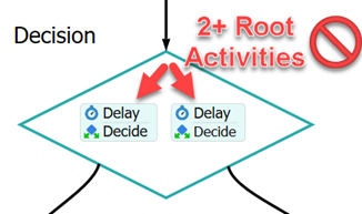
- If there is no single Start activity, then it will look for any single activity with no input connectors. If it finds such an activity, it will direct tokens to that activity.
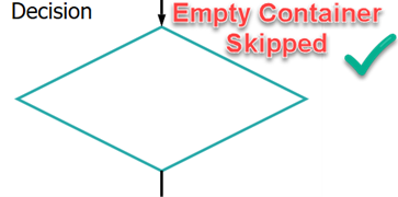
- If there are no activities in the container at all, and the container has a single output connector, tokens will be immediately sent "through" the flowchart container, as if the container did not exist between its two connectors.
- If the flowchart object contains activitities, but it cannot find a single activity to start, then when a token is sent through a connector into the flowchart container, FlexSim will throw an error saying it could not determine which activity to start.
Connectors Out of a Flowchart Container
When a flowchart container includes output connectors, FlexSim will use the following logic to determine where to send tokens that finish a contained activity with no connectors going out of it.
- If the finishing activity is a Sink, then the token will be destroyed.
- If the activity is a Finish, and the token is a child token started as part of a Run Sub Flow, then the token will finish the subflow.
- In all other cases, if a token finishes an activity that has no output connectors, the flowchart container's output connections will become a surrogate for the activity's output connectors. In other words, the activity will behave as if its container's output connectors were its own connectors.
Properties
The following image shows the properties that are available for all Flowchart objects:
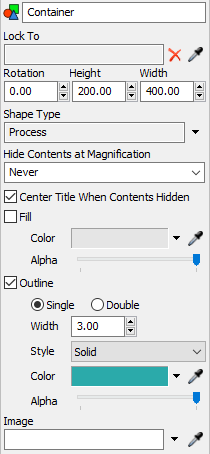
Each of these properties will be explained in the following sections.
Name
You can change the name of the object using the Name box. See Name for more information about this property.
Lock To
You can use the Lock To box to attach the Image object to an activity in your process flow. When the Image is locked to an object, it will move when that activity is moved. Use the Sampler button  to select the activity the Image object should be locked with.
Rotation
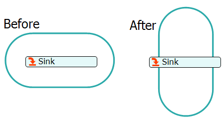
Using the Rotation box, you can set the angle (in degrees) at which the Flow Chart object will display. The base line is horizontal and the rotation is to the right. For example, a rotation value of 90 will result in the following image, which shows the object before and after rotation:
Height
The Height box the Flow Chart object's height.
Width
The Width box the Flow Chart object's width.
Shape Type
You can switch between the different kinds of flowcharting styles here. This will change the shape of the container accordingly.
Hide Contents at Magnification
You can specify a zoom level where when you zoom out further than that level the contents of this container will be hidden.
Center Title When Contents Hidden
When the Center Title When Contents Hidden checkbox is checked, the Container's title will be displayed in the center of the Container when the contents are hidden.
Fill
When the Fill checkbox is cleared, you will only be able to select the image by clicking on its edge. This setting allows you to prevent clicking and selecting the background image on accident.
If you want to be able to click anywhere inside the Image object, check the Fill box. When the box is checked, the following properties will become available:
- Color - Change the color of the Flow chart object's background by using the color selector. Alternatively, you can use the Sampler button to select a color from any object in your simulation model or process flow.
- The Alpha slider changes the transparency of the Image object.
Outline
If you check the Outline checkbox, the border of the Flow Chart object will be visible. There are a variety of properties you can use to change the border display:
- Single or Double - Use these options to switch to from a solid black line or a double line (which looks like it has a white stripe running through it).
- Width - Sets the border's width.
- Style - Changes the line style of the border.
- Thickness - Changes the thickness of the border.
- Color - You can change the color of the border by using the color selector or using the Sampler button to select a color from any object in your simulation model or process flow.
- The Alpha slider changes the transparency of the border.
Image
If you want to use a background image for your Flow Chart shape, use the Image box to choose the image. To browse for an image in your computer, click the arrow next to this box and select Browse from the menu.
Start Activity
The Start Activity property let's you expressly define which activity to start when a token is sent into a flowchart container's input connectors. If this property is not defined, then it will use default logic to determine which activity to start.
Description
The description property allows you to include a description of the flowchart object. This allows you to self-document your process flow.