Scenario Chart
Overview and Key Concepts
The Scenario Chart allows you to compare data from another chart across multiple Experiment scenarios (or Optimizer solutions) on a single chart.
To use the Scenario Chart, you must specify a target chart. The Scenario Chart will mimic the type of the target chart; if the target chart is a Bar Chart, the Scenario Chart will also be a Bar Chart. The Scenario Chart is compatible any of the following chart types:
In addition to specifying a target chart, you must also specify which scenarios you want to compare. The Scenario Chart uses this information to produce a chart that looks similar to the original chart, and also compares the requested scenarios. Since the Experimenter usually runs multiple replications per scenario, the Scenario Chart will aggregate data from all replications of each scenario. This way, the Scenario Chart will form a fair visual representation of the target chart's information for each scenario.Replication Aggregation
The Scenario Chart will aggregate data from all replications of each chosen scenario. Depending on the target chart's type, data may be aggregated quite differently. The following sections describe how the aggregation works in general.
Table Charts
If the Scenario Chart is based on a table chart, you will need to specify which columns of the table to aggregate, and how they should be aggregated. All other columns are considered identifier columns, and are used to determine which rows should be aggregated together.
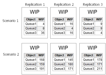
For example, suppose you had a table chart that showed the content of several queues. Then suppose you ran an experiment with two scenarios, and three replications per scenario. Each replication would produce a table chart, like the ones shown in the following image:
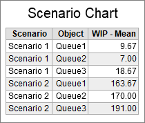
If you chose to compare Scenario 1 and Scenario 2, and to aggregate the WIP column, the Scenario Chart would look like the following:
Pie and Bar Charts
If the Scenario Chart is based on a Pie or Bar chart, then the Scenario chart will calculate the average value of each bar or pie segment across all replications of each scenario. Those averaged values will then be used to create an average version of each bar group or pie ring for each scenario.
For both charts, you may need to specify whether the text shown on the chart needs to be aggregated also. For example, a state pie chart might show a utilization percentage in the center. If text is present on each bar group or pie ring, but that text is not aggregated, then the Scenario Chart will use that text to identify which bar or segment values should be grouped together for aggregation.
Box Plots and Histograms
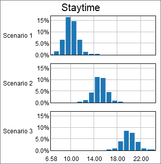
If the Scenario Chart is based on a Box Plot or Histogram, then the resulting chart will be a box plot or histogram of all data from all replications, for each scenario.
Time Plots
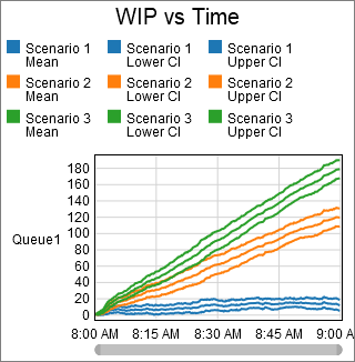
If the Scenario Chart is based on a Time Plot, you can specify an interpolation mode. If the interpolation mode is None, then all data from all replications will be drawn on the plot, colored by Scenario. Otherwise, you must addtionally specify a sample rate and a confidence interval. The Scenario Chart will create time intervals, based on the sample rate, and sample the data at those intervals. For each replication, it is likely that a data point was not recorded at the interval time, so the Scenario Chart will interpolate to find the value. Those interpolated values are then aggregated to determine the mean. In addition, you can also show the min, max and confidence interval values.
The Data Tab
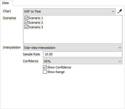
The data tab has the following properties:
- Chart - Select which chart the Scenario Chart will be based on. You can select a chart from the list, or use the sampler.
- Scenarios - Select which scenarios you would like to compare on the same chart.
Additional properties may appear on the data tab, depending on the specified chart. These are described in the following sections:
Time Plot
If a time plot is specified, the following properties will appear:
- Interpolation - Select how the Scenario
Chart will interpolate between replication values. There are three possible
values:
- None - The Scenario chart does not calculated the mean; it displays all values from all replications, colored by scenario.
- Stair-Step - In order to calculate the mean value over time, the Scenario chart samples all replication values at specific points in time. If a given replication doesn't have a value recorded at that point in time, the scenario chart will use the newest value that is previous to the sample time.
- Linear - In order to calculate the mean value over time, the Scenario chart samples all replication values at specific points in time. If a given replication doesn't have a value recorded at that point in time, the scenario chart will linearly interpolate between existing data.
- Confidence - Specifies the value level of confidence to use if confidence is shown.
- Show Confidence - Check this box to have the Scenario Chart calculate and display the confidence interval vs. time.
- Show Range - Check this box to have the Scenario Chart calculate and display the min and max value vs. time.
Table Chart
If a table chart is specified, the following properties will appear:
- Aggregate Columns - Select which columns will be aggregated. The values in the other columns will be used to group rows together for aggregation.
- Show Mean - Check this box to display the mean value of the aggregated columns.
- Show Min - Check this box to display the minimum value of the aggregated columns.
- Show Max - Check this box to display the maximum value of the aggregated columns.
Bar Chart
If a bar chart is specified, the following properties will appear:
- Aggregate title value - Check this box if the text shown as the title value on the bar chart should be aggregated.
- Aggregate bar value - Check the box if the text shown as the bar value should be aggregated.
Pie Chart
If a pie chart is specified, the following properties will appear:
- Aggregate title value - Check this box if the text shown as the title value on the bar chart should be aggregated.
- Aggregate center value - Check the box if the text shown as the center value should be aggregated.
The Advanced Tab
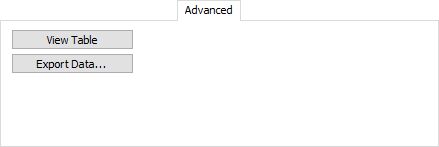
The Advanced tab has the following properties:
- View Table - Click this button to open a view of the data displayed by the chart.
- Export Data... - Click this button to export the data displayed by the chart to a CSV file.
Other Tabs
Other tabs will appear on the Scenario Chart properties window. However, the other tabs deal with the settings specific to the specified chart.