Histogram
Overview and Key Concepts
The histogram allows you to create a histogram of a set of data. Histograms are useful for showing the distribution of a set of values.
Data Format
At a minimum, the histogram requires a table with a single column, where each row contains a value that should counted in one of the histogram's buckets. However, you can use additional columns to categorize each data point by color and/or by axis.
For example, the table below has three columns:
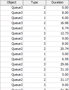
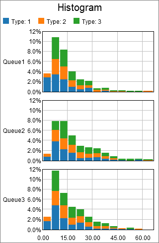
The data used to create the histogram is found in the Duration column. The other two columns are used to categorize each point. The chart shown at the beginning of this section categorized points first by the value in the Object column, then by the value in the Type column. Each unique Object column value adds an additional axis, and each unique Type value adds a unqiue color.
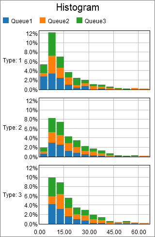
Given the table shown above, you could use the Type column to determine the axis, and the Queue column to determine the color. The resulting chart might look like the following:
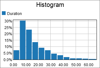
Alternatively, you could choose to ignore any categorizing values, to get a feel for the overall distribution. If you used the previous table to make a histogram without categorizing any points, it might look like the following:
The Data Tab
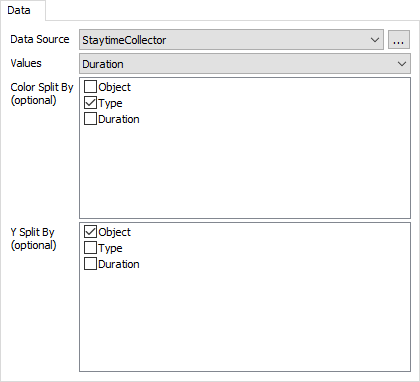
The data tab has the following properties:
- Data Source - Choose a valid data source from the drop down list. All Statistics Collectors and Calculated Tables are shown. You can also choose the last option to create a new Statistics Collector. You can click the accompanying button to open the properties window for the selected data source.
- Values - Choose a column from the data source that contains the values you wish to be counted as part of the histogram. This column cannot contain text.
- Color Split By - Optional. These columns are used to categorize each data point by color. Each unique combination of values in the list becomes a new category, and each category is marked with a different color.
- Y Split By - Optional. These columns are used to categorize each data point by axis. Each unique combination of values in the list becomes a new category, and each category is shown on a different y axis.
The Settings Tab
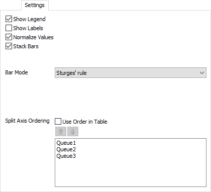
The settings tab has the following properties:
- Show Legend - Check this box to show the legend. Clear the box to hide the legend.
- Show Labels - Check this box to show the value of each bar at the top of the bar. Clear the box to hide the value labels.
- Normalize Values - Check this box to show each bar as a percentage of the total, rather than the raw count. Clear this box to show each bar as the count for that range.
- Stack Bars - Check this box to show different data sets stacked.
- Bar Mode - Choose how bucket boundaries are generated.
There are several options for this property:
- By Number of Buckets - With this option, you must specify how many Buckets will exist on the chart. There will be one bar per bucket, per category.
- By Bucket Width - With this option, you must specify how wide each bucket will be, and where the buckets start from.
- Sturges' Rule - Uses Sturges' rule to determine the number of buckets.
- Scott's Rule - Uses Scott's rule to determine the number of buckets.
- Freedman-Diaconis Rule - Uses the Freedman-Diaconis rule to determine the number of buckets.
- Split Axis Ordering - This property controls the order of each Y axis. If you check the Use Order in Table box, the chart will sequence the Y axes to match the order found in the table. If the box is cleared, the chart will use the ordering given in the list. You can reorder the list using the up and down arrows.
The Text Tab
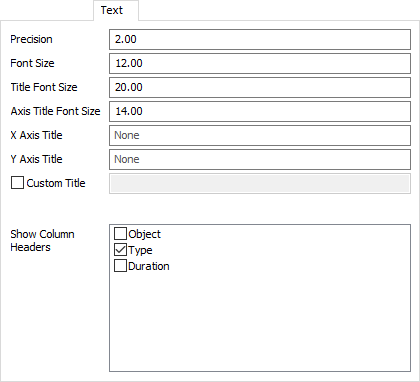
The text tab has the following properties:
- Precision - Specify the precision to use for the x axis, and for tooltips.
- Font Size - Set the font size for general text on this chart in pixels.
- Title Font Size - Set the font size for the chart title, as well as axis titles (if present), in pixels.
- X Axis Title - Optional. Specify the text for the x-axis title.
- Y Axis Title - Optional. Specify the text for the y-axis title.
- Custom Title - If checked, the chart will show this property's value as the chart title. You can use this property to specify a title with special characters, or to specify that no title should be shown.
- Show Column Headers - This list allows you to specify which values, if that value is written as text on the chart, should include the column header for that value. For example, if you have a Type column, you might want the chart to show "Type: " before any type values are written.
The Colors Tab
This tab is identical to the Time Plot Colors tab. For more information, see Time Plot Colors.
Performance Measures
The Histogram provides performance measures based on aggregations of the Values column, including the Average, Sum, Minimum, and Maximum. In addition, if some columns are marked as Split-by columns, the chart will provide the same aggregations for each unique combination of Split-by values.