Time Plot
Overview and Key Concepts
The time plot chart allows you to create line charts, stair-step charts, and scatter plots.
Data Format
At a minimum, the time plot requires a table to have at least two columns: one column that contains an x value, and another that contains a y value. Each row identifies a unique point. If there are additional columns in the table, you can use them to categorize each point. Each point can be categorized by color, as well as by axis.
For example, the table below has four columns:
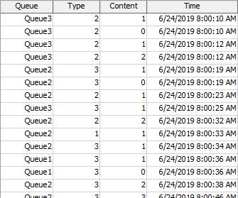
The data for the x values are found in the Time column, and the data for the y values are found in the Content column. Each row defines a single point, with the given x and y value.
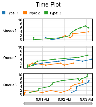
The other columns are used to categorize each point. The chart shown at the beginning of this section categorized points first by the value in the Queue column, then by the value in the Type column. Each unique Queue column value adds an additional axis, and each unique Type value adds a unique color.
Given the table shown above, you could use the Type column to determine which axis to put the point on, and the Queue column to determine what color the point should be. If you did, the chart might look as follows:
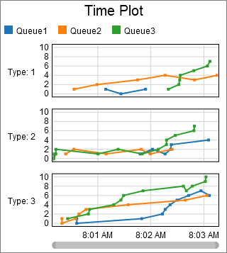
The two plots shown previously display the same data points, but they are categorized into different axis groups, and into different color groups.
The Data Tab
The data tab has the following properties:
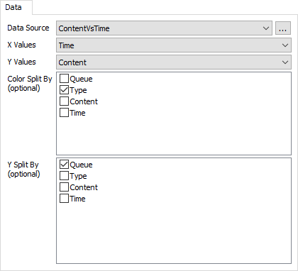
- Data Source - Choose a valid data source from the drop down list. All Statistics Collectors and Calculated Tables are shown. You can also choose the last option to create a new Statistics Collector. You can click the accompanying button to open the properties window for the selected data source.
- X Values - Choose a column from the data source that contains the x-axis values you wish to plot. This column cannot contain text. If this column is formatted as Date / Time, then the x axis will become a time axis.
- Y Values - Choose a column from the data source that contains the y-axis values you wish to plot. This column cannot contain text. If this column is formatted as Date / Time, then the y axis will become a time axis.
- Color Split By - Optional. These columns are used to categorize each data point by color. Each unique combination of values in the list becomes a new category, and each category is marked with a different color.
- Y Split By - Optional. These columns are used to categorize each data point by axis. Each unique combination of values in the list becomes a new category, and each category is shown on a different y axis.
The Settings Tab
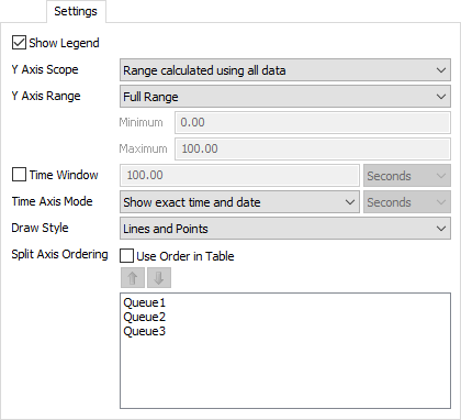
The settings tab has the following properties:
- Show Legend - Check this box to show the legend. Clear the box to hide the legend.
- Y Axis Scope - Select how the range for each Y axis is determined.
There are two possible values:
- Range calculated using all data - Each Y axis will be calculated using all data from the entire table. This option ensures that all Y axes will have the same scale and offset.
- Range calculated using data within axis - Each Y axis will be calculated using only the data that belongs to that axis. The option ensures that each Y axis will have the location and scale required to show only the data on that axis.
- Y Axis Range - Select the desired range for the Y axis. There are three available options:
- Full Range - The range of the Y axis will always include the complete range of data.
- Adaptive Range - The range of the Y axis will adapt to the visible data.
- Fixed Range - The range of the Y axis is set according to the Minimum and Maximum values
- Time Window - If checked, the chart will keep only the most recent time period in view. You can specify the desired time to keep in view.
- Time Axis Mode - You can specify whether to show the exact calendar time, or the duration from the start of the model on the time axis. If you choose to show duration, you can specify the time units that the time axis will show.
- Draw Style - Choose how data points are connected.
There are three options for this property:
- Points - each x/y pair is drawn as a point on the chart.
- Line - each x/y pair is connected by a line.
- Lines and Points - each x/y pair is connected by a line, and is drawn as a point on the chart.
- Stair Step - each x/y pair is connected by a horizontal line, followed by a vertical line.
- Area - the sequence of x/y pairs is used to create a filled shape.
- Split Axis Ordering - This property controls the order of each Y axis. If you check the Use Order in Table box, the chart will sequence the Y axes to match the order found in the table. If the box is cleared, the chart will use the ordering given in the list. You can reorder the list using the up and down arrows.
The Text Tab
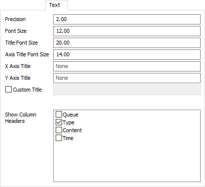
The text tab has the following properties:
- Precision - Specify the number of decimals to use on the chart. Note that this will only apply to text for floating point values.
- Font Size - Set the font size for general text on this chart in pixels.
- Title Font Size - Set the font size for the chart title in pixels.
- Axis Title Font Size - Set the font size for the axis titles in pixels.
- X Axis Title - Optional. Specify the text for the x-axis title.
- Y Axis Title - Optional. Specify the text for the y-axis title.
- Custom Title - If checked, the chart will show this property's value as the chart title. You can use this property to specify a title with special characters, or to specify that no title should be shown.
- Show Column Headers - This list allows you to specify which values, if that value is written as text on the chart, should include the column header for that value. For example, if you have a Type column, you might want the chart to show "Type: " before any type values are written.
The Colors Tab
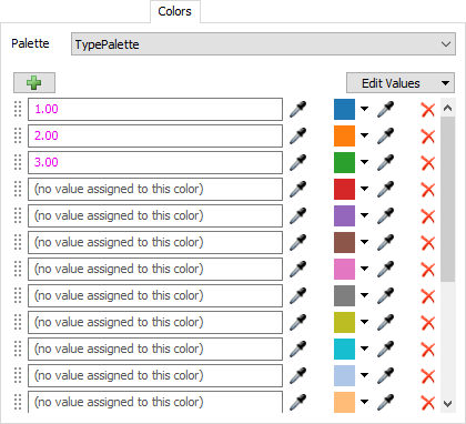
For all charts that use colors, the Colors tab allows you to choose which Color Palette the chart uses. In addition, you can configure the colors and values for that palette. For more information on Color Palettes, see the Color Palette topic.
Performance Measures
The Time Plot provides aggregations of the Y Values column as performance measures. Possible aggregations include:
- Average
- Sum
- Minimum
- Maximum
- Last Value
- Time-Weighted Average
If any columns are marked as Split By columns, then for each unique split-by value, the chart will provide the same aggregations, but filtered exclusively for the split-by value.