Gantt Chart
Overview and Key Concepts
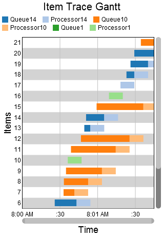
The Gantt chart allows you to create gantt plots, which are useful for tracking progress over time.
The data for a gantt chart must be laid out in a particular way for the gantt chart to properly draw. That table should look similar to the table shown here:
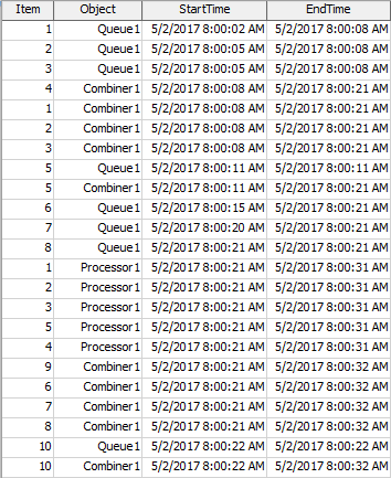
The Gantt chart draws one colored box for each row. It uses one column to determine which row the box is drawn on. Another column is used to determine the color of the box. The final two columns are used to determine the beginning and end of the box. You can specify the columns that will be used on the Data tab. The order of the columns does not matter.
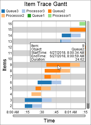
When you hover over a colored box, a popup will appear, with information related to the specific box:
The Data Tab
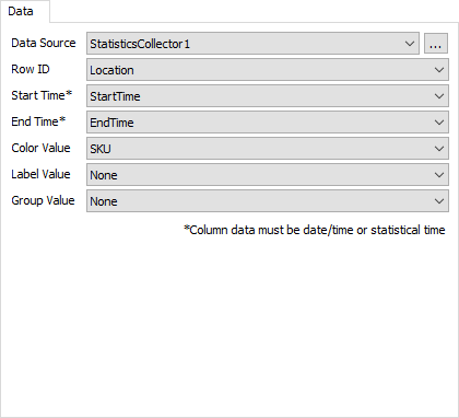
The data tab has the following properties:
- Data Source - Choose a valid data source from the drop down list. All Statistics Collectors and Calculated Tables are shown. You can also choose the last option to create a new Statistics Collector. You can click the accompanying button to open the properties window for the selected data source.
- Row ID - Choose a column from the data source that contains the values you want to use as the Row ID. Each unique value in this column will correspond to a new row.
- Start Time - Choose a column from the data source that contains the start time for the box on the gantt chart. This column must have FlexSim time data in it.
- End Time - Choose a column from the data source that contains the end time for the box on the gantt chart. This column must have FlexSim time data in it.
- Color Value - Choose a column from the data source that contains the value for the box on the gantt chart. Each unique value is assigned a unique color.
- Label Value - Optional. If selected, data from the specified column will be printed on each box, if the box is big enough.
- Group Value - Optional. If selected, data from the specified column will be used to group the boxes. If you click on a box in the chart, all boxes with the same group value will be highlighted.
The Settings Tab
The settings tab has the following properties:
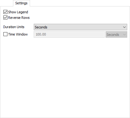
- Show Legend - Check this box to show the legend. Clear the box to hide the legend.
- Reverse Rows - When checked, the chart draws the most recent rows at the top.
- Duration Units - Specifies the units for the duration shown in the hover information.
- Time Window - When checked, the chart automatically adjust the horizontal scroll to show only the most recent time period, which you must specify when using this option.
- Precision - Specify the number of decimals to use on the y axis.
- Font Size - Set the font size for general text on this chart in pixels.
- Title Font Size - Set the font size for the chart title in pixels.
- Axis Title Font Size - Set the font size for the axis titles in pixels.
- X Axis Title - Optional. Specify the text for the x-axis title.
- Y Axis Title - Optional. Specify the text for the y-axis title.
The Text Tab
The text tab has the following properties:
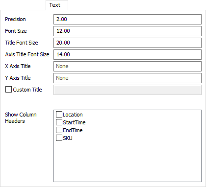
- Precision - Specify the precision to use for the x axis, and for tooltips.
- Font Size - Set the font size for general text on this chart in pixels.
- Title Font Size - Set the font size for the chart title, as well as axis titles (if present), in pixels.
- X Axis Title - Optional. Specify the text for the x-axis title.
- Y Axis Title - Optional. Specify the text for the y-axis title.
- Custom Title - If checked, the chart will show this property's value as the chart title. You can use this property to specify a title with special characters, or to specify that no title should be shown.
- Show Column Headers - This list allows you to specify which values, if that value is written as text on the chart, should include the column header for that value. For example, if you have a Type column, you might want the chart to show "Type: " before any type values are written.
The Colors Tab
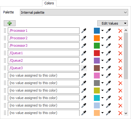
For all charts that use colors, the Colors tab allows you to choose which Color Palette the chart uses. In addition, you can configure the colors and values for that palette. For more information on Color Palettes, see the Color Palette topic.
Performance Measures
The Gantt chart provides performance measures based on the durations. The duration of a given row in the table is the difference between the End Time column and the Start Time column. The chart will provide the Average, Sum, Minimum, or Maximum of all durations as a performance measures. For each unique value in the Value column, the chart will also provide the Average, Sum, Minimum, or Maximum of all durations for that value as a performance measure.