Bar Chart
Overview and Key Concepts
The Bar chart can be used to visualize and compare similar values from many objects. The example below shows the time in state for several objects.
There are two possible formats for the data table for the bar chart. The are described in the following sections.
One Bar Group per Row
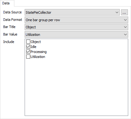
This is the simpler format. The bar chart assumes that each row in the table represents a group of bars. You can specify which columns to draw individual bars for. In addition, you can specify up to to columns to display to the left of the bars. Here is an example table:
With this data format and table, you can specify the following settings:
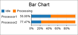
With those settings, the resulting chart would be similar to the following:
One Bar per Row
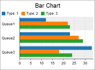
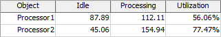
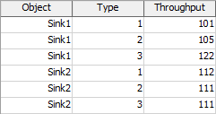
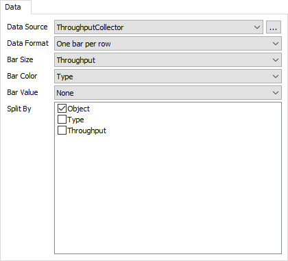
This format is more flexible. In this format, the bar chart assumes that each row represents a single bar in the bar group. You can specify which column determines the bar's size, which column determines the bar's color, and which column(s) determine how the bars are grouped. Here is an example table:
With this data format and table, you can specify the following settings:
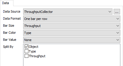
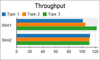
With those settings, the resulting chart would be similar to the following:
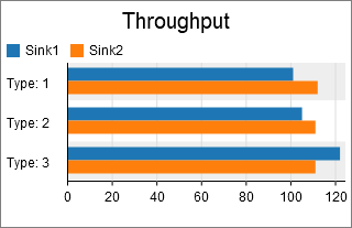
You could alternatively use the following settings, where the Bar Color and Split By options are switched:
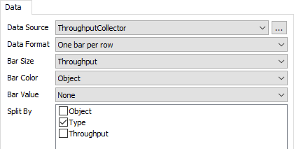
This switch in settings creates a chart like the following:
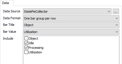
The Data Tab
The data tab has the following properties:
- Data Source - Choose a valid data source from the drop down list. All Statistics Collectors and Calculated Tables are shown. You can also choose the last option to create a new Statistics Collector. You can click the accompanying button to open the properties window for the selected data source.
- Data Format - Choose a data format. For more information on data formats, see the Overview and Key Concepts section.
If the Data Format property is set to One bar per row, then the data tab has these additional properties:
- Bar Title - Choose a column from the data source that contains the values you want to use as the title of each row. If you select the first option, for None, then no text will be displayed on the Y axis.
- Bar Value - Choose a column from the data source that contains the values you want to show as additional text on this row.
- Include - Choose which columns will be included in the bar chart. If the bar chart is showing percentages, the percentage is calculated from the selected columns only. Each included column must not contain text.
If the Data Format property is set to One segment per row, then the Data Tab has these additional properties:
- Bar Size - Choose a column that determines the size of the bar. This column should contain number data.
- Bar Color - Optional. Choose a column that determines the color of the bar.
- Bar Value - Optional. Choose a column that displays data left of the bar. If there are multiple rows for the same bar group, then the last value for that group will be used.
- Split By - Optional. For each Split By column specified, the bar chart will make one bar group per unique combination of values in those columns.
The Settings Tab
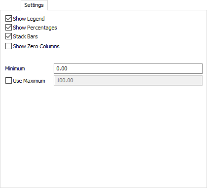
The settings tab has the following properties:
- Show Legend - Check this box to show the legend. Clear the box to hide the legend.
- Show Percentages - Check this box to show the bar chart in percentage mode, rather than by raw value. If this box is cleared, then the x-axis will switch to raw value mode
- Stack Bars - Check this box to display the bars stacked horizontally. Clear this box to show each bar side by side.
- Show Zero Columns - Check this box to display legend items for all columns. Clear this box to show only columns where at least one row has data, which implies only showing legend items for visible bars.
- Minimum - Specifies the minimum value for this chart. The value should be non-negative.
- Use Maximum - If checked, the chart will use the supplied maximum value, rather than determining the maximum automatically.
The Text Tab
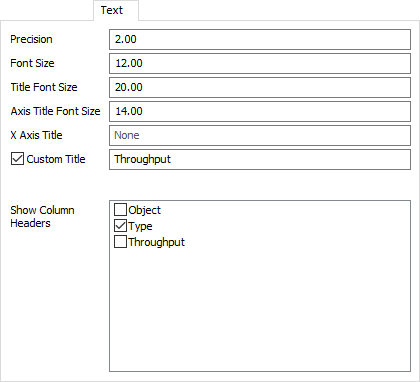
The text tab has the following properties:
- Precision - Specify the number of decimals to use on the chart.
- Font Size - Set the font size for general text on this chart in pixels.
- Title Font Size - Set the font size for the chart title.
- Axis Title Font Size - Set the font size for the axis titles.
- X Axis Title - Specify what text to show for the x-axis title
- Custom Title - If checked, the chart will show this property's value as the chart title. You can use this property to specify a title with special characters, or to specify that no title should be shown.
- Show Column Headers - This list allows you to specify which values, if that value is written as text on the chart, should include the column header for that value. For example, if you have a Type column, you might want the chart to show "Type: " before any type values are written.
The Colors Tab
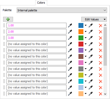
For all charts that use colors, the Colors tab allows you to choose which Color Palette the chart uses. In addition, you can configure the colors and values for that palette. For more information on Color Palettes, see the Color Palette topic.
Performance Measures
The Bar Chart provides the following performance measures:
If the Bar Value is set to a numeric column, then the chart will provide the Average, Sum, Minimum, or Maximum of that column as a performance measure.
For each included column, the chart will provide the Average, Sum, Minimum, or Maximum of the column as a performance measure.