Task 1.2 - Get Data from the 3D Model
Task Overview
In this tutorial task, you'll learn how to get data from your model using various simulation tools such as dashboards, charts, and statistics collectors.
Since the purpose of building this simulation model is to make the customer service center more efficient and to increase customer satisfaction, you'll gather data with the purpose of answering the following questions:
- How long does the waiting line get at various points during the simulation?
- What is the average amount of time that customers spend waiting in line?
- How many customers are leaving feeling satisfied or unsatisfied?
- What percentage of the time is the service desk busy helping customers (as opposed to being idle)?
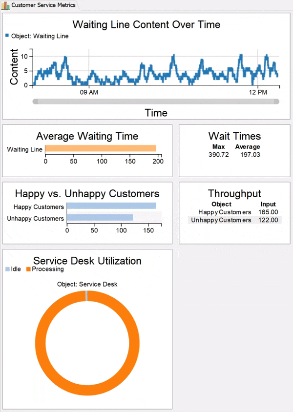
You'll learn how to create charts that will help you better answer these questions. When you're finished, you'll create a dashboard that has charts similar to the ones in the following image:
Step 1 Create a Dashboard
In this step, you'll add a dashboard to your simulation model. A dashboard is a blank space that you can fill up with charts that will display data about your simulation model as it runs, updating in real time. You'll create the actual charts in the next step.
In this step, you'll add, rename, and resize the dashboard:
- On the main toolbar, click the Dashboards button to open a menu. Select Add a dashboard. The new dashboard will open as a separate pane to the right of the 3D model.
- In Properties in the Dashboard Name box, delete the current text and type Customer Service Metrics to give the dashboard a new name.
- Lastly, you'll resize the dashboard so it is a little bigger. Mouse over the left edge of the dashboard until the mouse pointer changes to a set of arrows.
- Click the edge of the window or pane and drag it until the dashboard pane is about a third larger than the default size.
Step 2 Pin a Statistic from Properties
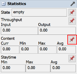
In this step, you'll learn how to pin a statistic from a 3D object to your dashboard. Each object in your 3D model collects automatic statistics such as its current content (how many flow items are currently at that fixed resource) and its staytime (how long flow items are staying at the fixed resource). You can view these statistics for a specific object in Properties and watch them update in real time as a simulation runs.
You can also pin statistics from these objects to the dashboard to help with data collection. Since you're interested in gathering data about the customer waiting times, you'll pin some content statistics for the Waiting Line queue to the dashboard in this step.
When you pin a statistic to the dashboard, it automatically creates something called a statistics collector to track this data. Statistics collectors work behind the scenes to gather specific data from the objects in your model. During a simulation run, each statistics collector listens to events on the 3D objects in the model and collects data about those events in a data table. You can either view the data table directly or visualize the data using a chart in the dashboard. (You can also export the table if you would prefer to analyze or visualize the data using a third-party software program such as Excel or Tableau.) See the chapter about Getting Data from Your Simulation Model for more information.
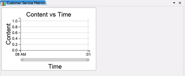
You'll use this statistic to create a timeplot chart that will show the content of the waiting line as it increases or decreases over time. To create this chart:
- In the 3D model, click the Waiting Line queue to select
it. In Properties, click the Expand button
 next to the
Statistics group to open the object's statistics.
next to the
Statistics group to open the object's statistics. - Next to the Content statistics, click the
Pin button
 to open a menu. Point to Pin to Customer Service Metrics,
then select Content vs Time.
to open a menu. Point to Pin to Customer Service Metrics,
then select Content vs Time. - Confirm that the Content vs Time chart now appears in the dashboard. If the chart is not already selected, click this chart to select it. Mouse over the right edge of the chart until the mouse point changes to a set of arrows. Drag the edge of the chart to make it bigger.
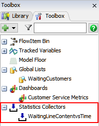
- Open the Toolbox in the left pane. Under the Statistics Collectors group, confirm that there is a new WaitingLineContentvsTime statistics collector.
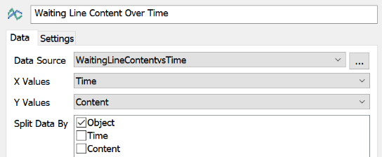
- In the dashboard, double-click the Content vs Time chart to open its properties.
- In the name box at the top of the properties, change the chart's display name to Waiting Line Content Over Time.
- Confirm that the Data Source displays the WaitingLineContentvsTime Statistics Collector.
- Press the OK button to save the changes and close the window.
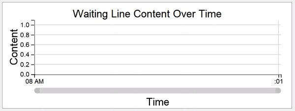
If you were to run your simulation model at this point, your chart would look similar to this over time:
Step 3 Add a Chart from the Library
In this step, you'll learn how to add a chart from the Library to the dashboard. When you pin a chart from the dashboard, most of the time you get a simple text display. However, you'll notice that when you have the dashboard open and active, the Library (in the left pane) changes to show a variety of charts. You can choose a chart from the Library depending on how you would like to visualize the data.
In this step, you'll add charts that will track the staytime of customers in the waiting line. These statistics will give you data about the average and maximum wait times that customers are experiencing.
To add a chart from the library:
- In the 3D model, click the Waiting Line queue again to select it.
- Next to the Staytime statistics, click the
Pin button
to open a menu. Point to
Pin to Customer Service Metrics, then select
Staytime. Notice that there is now both a new chart in the
dashboard and a new statistics collector named WaitingLineStaytime in the
Toolbox.
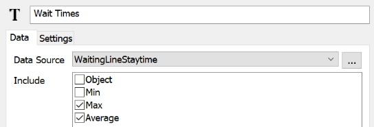
- In the dashboard, double-click the Staytime chart to open its properties.
- In the name box at the top of the properties, change the chart's display name to Wait Times.
- In the Include group, clear the Object and Min checkboxes. Press the OK button to save the changes.
- In the left pane, click the Library tab to switch to the Library. (Make sure the dashboard is still the active window.)
- Under the Charts group, drag a Bar Chart to the dashboard. Its properties window will open automatically.
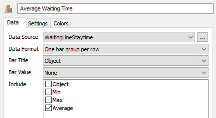
- In the name box at the top of the properties, change the chart's display name to Average Waiting Time.
- In the Data tab, open the Data Source menu and select WaitingLineStaytime.
- In the Bar Title menu, select Object.
- In the Include group, clear the Object checkbox and check the Average checkbox.
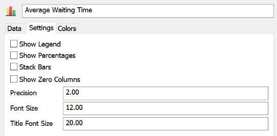
- In the Settings tab, clear the Show Legend and Show Percentages checkboxes.
- Press the OK button to save the changes and close the properties.
- Feel free to resize or re-position the charts in the dashboard as needed.
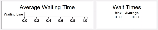
If you were to run your simulation model at this point, your charts would look similar to this over time:
Step 4 Create a Custom Statistics Collector
Up to this point, you've used the auto-generated statistics collectors to create your charts. In this step, you'll customize a statistics collector to compare two sources of data: the ratio of unhappy customers to happy customers. You'll measure this by comparing the number of customers that exit through the Happy Customers sink as opposed to the Unhappy Customers sink. The throughput statistic is the best statistic for capturing this kind of data.
This is also the first tutorial in which you will use a useful tool called the Sampler
button  . When you click this button, your
mouse will change to a sampler icon to indicate that you're in sampling mode. In sampling
mode you can sample objects in your simulation model quickly and easily as needed. In this
step, you'll sample one of the sinks to add it to your custom statistics collector.
. When you click this button, your
mouse will change to a sampler icon to indicate that you're in sampling mode. In sampling
mode you can sample objects in your simulation model quickly and easily as needed. In this
step, you'll sample one of the sinks to add it to your custom statistics collector.
To create a custom statistics collector:
- In the 3D model, click the Happy Customers sink to select it.
- In Properties next to the Throughput statistics,
click the Pin button
to open a menu. Point to
Pin to Customer Service Metrics, then select
Throughput. Notice that there is now both a new chart in
the dashboard and a new Statistics Collector named HappyCustomersThroughput in
the Toolbox.
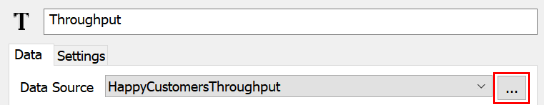
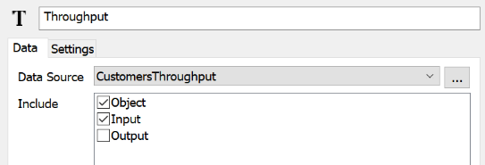
- In the dashboard, double-click the Throughput chart to open its properties.
- In the Data tab, confirm that the Data Source menu displays HappyCustomersThroughput. Then press the ... button next to this menu to open the properties window for this statistics collector.
- In the name box at the top of the properties, change the statistics collector's name to CustomersThroughput.
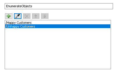
- In the Events tab click the
EnumeratedObjects from the list on the left. Then under the
Objects section click the
Sampler button
to enter sampling mode. Notice that your
mouse pointer changes to a sampler icon.
- Click the Unhappy Customers sink in the 3D model to sample it and add it to the Enumerated Rows.
- Press the OK button to save the changes and return to the chart properties.
- With the Data tab open in the chart properties, in the Include list, clear the Output checkbox.
- Press the OK button to save the changes.
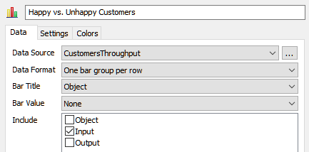
- In the Library under Charts, drag another Bar Chart into the dashboard. Its properties will automatically pop up.
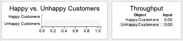
- In the name box at the top of the properties, change the chart's display name to Happy vs. Unhappy Customers.
- In the Data tab, click the Data Source menu and select CustomersThroughput.
- Click the Bar Title menu and select Object.
- In the Include list, check the Input box.
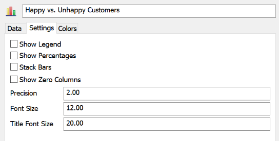
- In the Settings tab, clear the Show Legend and Show Percentages checkboxes.
- Press the OK button to save the changes and close the window.
If you were to run your simulation model at this point, your charts would look similar to this over time:
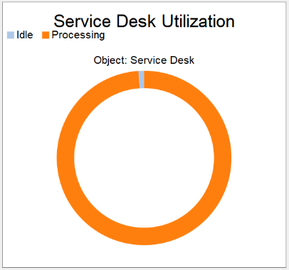
Step 5 Create a State Chart
In this step, you'll add one last chart to your dashboard: a pie chart that shows how well the service desk is being utilized. To create this chart:
- In the 3D model, click the Service Desk process to select it.
- In Properties next to the State box, click the
Pin button
to open a menu. Point to Pin to Customer Service Metrics,
then select Pie Chart. Notice that there is now both a new
chart in the dashboard and a new Statistics Collector named ServiceDeskPieChart
in the Toolbox.
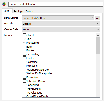
- Double-click the Pie Chart to open its properties.
- In the name box at the top of the properties, change the chart's display name to Service Desk Utilization.
- In the Include list, clear all of the checkboxes except Idle and Processing.
- Press the OK button to save the changes and close the window.
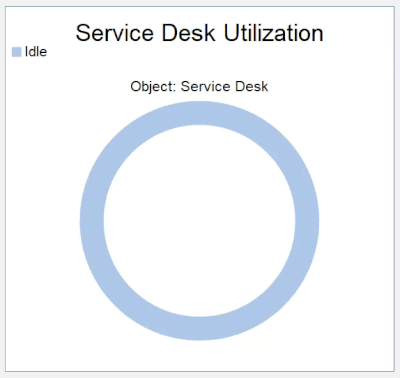
If you were to run your simulation model at this point, your chart would look similar to this over time:
Step 6 Analyze the Data
In this step, you'll run your simulation model and view your charts. Using the information gathered from these charts, you'll learn how to identify problem areas in your business system.
If you haven't already, you should change the speed at which your simulation model runs to 1000 so that you can get more comprehensive data faster. You should also set the simulation model to stop running after 12 hours (43,200 seconds). See Step 6 in the previous tutorial task for specific directions.
Press the Reset button on the simulation bar to reset the model. Then press the Run button.
As the simulation runs, the charts will update in real time. When the chart is finished, analyze them to see what they the reveal about the potential problems in the customer service center.
For example, notice that, while there are more happy customers than unhappy customers overall, there is still an unacceptable number of customers who left because of overly long waiting times:
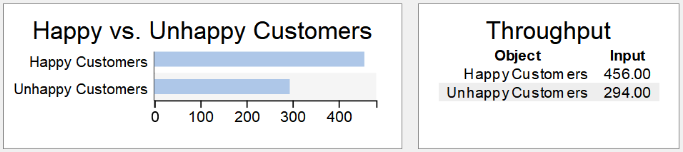
Also notice that the service desk was utilized almost constantly. It is good that the employees at the service desk are always working hard and are constantly helping customers. But the lack of any down time probably indicates that the service desk is being over-utilized.
Based on these results, it might be good to experiment with adding more service desks to see how many desks will help increase the number of happy customers without causing too much idle time. You'll make this change by the end of the last task in this tutorial.
Conclusion
In the next tutorial task, you'll build this same simulation model using the Process Flow tool, which provides a different approach to modeling. Continue to Tutorial Task 1.3 - Build a Process Flow Model.