Legacy Dashboard Graphs
Introduction to Legacy Dashboard Graphs
The following sections describe the different tabs that are available on various charts and graphs in the Dashboard tool.
The Associations Tab
There are multiple ways to add associations to the custom chart:
- Tree Browse Dialog - For more information on the tree browse dialog, see the tree browse dialog page.
- Global Variables / Tables - The list of Global Variables and Global Tables will be populated based upon what is available in your model. The list of global variables will only include integer and double types.
- Sampler - Sample objects from the model.
- Object Selection Window - The current mode is highlighted at the top of the browsing window.
- Browse by Class - This method of adding objects sorts the objects by class. To select an entire class, click on the type icon. Click on an object to select or deselect it.
- Browse by Group - This method of adding objects sorts the objects by group. To select an entire group, click on the type icon. Click on an object to select or deselect it.
- Browse by Object - This method of adding objects lists all objects in the model. Click on an object to select or deselect it.
- Select by Dragging - This method of adding objects uses the 3D model view. Simply drag the target icon from the current window to an object in the model you would like to add.
The Associations tab has the following properties:
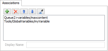
Associations are objects, nodes, or variables in your model.
| Icon | Description |
|---|---|
 |
Adds associations to the current list of associations. |
 |
Remove the selected associations from the list. |

 |
Move the selected associations up or down in the list. |
 |
Sample a node or object in the model. |
Display Name
When using groups, if no display name is specified, the titles displayed for the group members will be their path in the model.
The Colors Tab
The colors page allows you to define colors for your graph. The options available are based upon the graph. For State charts, each State has a color. Notice in the above image there are two colors displayed. The color on the left is the normal color for that state. The color on the right is the translucent color used when Show Yellow Checked States as Translucent is checked from the Utilization Analysis tab. For statistic graphs (Avg. Content, etc), the colors are for each statistic. Line charts define colors for each object or group. Gantt Charts either display colors for States or for objects.
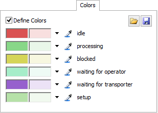
Colors are not available for Text graphs.
| Icon | Description |
|---|---|
 |
Loads saved color schemes and allows you to edit color schemes in the tree. |
 |
Saves the current color scheme. |
 |
Displays a color palette. |
|
Allows you to sample a color in FlexSim or outside of FlexSim. |
Define Colors
Check to define a custom set of colors.
Item Trace Gantt and Custom Chart
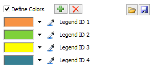
The Item Trace Gantt Chart and the Custom Chart dynamically add Legends or Series to
their charts so a and
are available to add and remove
colors.
The Data Tab
The Data tab is used by the Custom Chart and the Custom Gantt Chart. The Data tab gives you multiple picklists that allow you to customize the data to be displayed on your chart. It has the following properties:
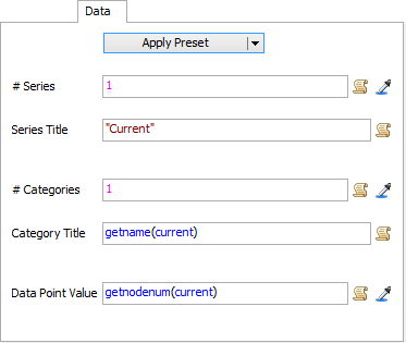
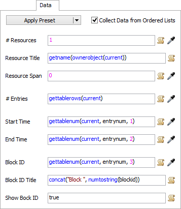
Apply Preset
This button contains a list of presets to get you started on using the custom chart or custom gantt chart. The presets include code to access values from tables, bundles etc.
The General Tab
The General page of Dashboard graphs vary depending on the statistic object and upon the display type.
Line Chart
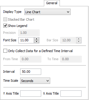
Line charts have the following general properties:
- Display Type - This option changes the display style of graph.
- Stacked Bar Chart - Bar Chart Only. This option stacks each segment of the data for one object into a single bar.
- Show Legend - This option adds a legend to the graph.
- Precision - This defines the number precision of graph text. Not available for line graphs.
- Font Size - This defines the font size of graph text.
- Bar Size - Bar Chart Only. This defines the bar height for Bar Charts.
- Only Collect Data for a Defined Time Interval - This option creates a time period during which statistics for this graph will be recorded.
- From Time - This defines when statistics will start being recorded.
- To Time - This defines when statistics will no longer be recorded.
- Interval - This defines how often a line graph will update.
- Time Scale - This defines the time scale that numbers will be displayed in along the x-axis.
- Y Axis Title - Text that will display along the Y Axis.
- X Axis Title - Text that will display along the X Axis.
State Statistic Graphs
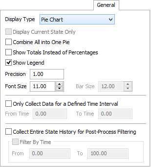
State Statistic Graphs have the following general properties:
- Display Type - This option changes the display style of graph.
- Display Current State Only - This option is only available for Table of Values charts. Displays the current state name of objects.
- Combine All into One Pie - This option combines all pie charts into a single pie chart. It averages the values from all objects.
- Show Totals Instead of Percentages - This option changes the displayed values from percentages to overall totals.
- Show Legend - This option adds a legend to the graph.
- Precision - This defines the number precision of graph text.
- Font Size - This defines the font size of graph text.
- Bar Size - Bar Chart Only. This defines the bar height for Bar Charts.
- Only Collect Data for a Defined Time Interval - This option creates a time period during which statistics for this graph will be recorded.
- From Time - This defines when statistics will start being recorded.
- To Time - This defines when statistics will no longer be recorded.
Post-Process Filtering
If the Collect Entire State History for Post-Process Filtering option is checked, FlexSim will record when each state change occurred for every object in the graph. After running the model, you can check the Filter By Time option and enter a time interval in the From and To fields. If you then click Apply or Update, the graph will display the state data for just that time interval. The Filter By Time option is unchecked when you Reset the model.
Gantt Chart
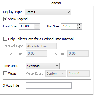
Gantt charts have the following general properties:
- Display Type - This option changes the display type of graph. This may either be States or Item Trace.
- Show Legend - This option adds a legend to the graph.
- Font Size - This defines the font size of graph text.
- Bar Size - This defines the bar height.
- Only Collect Data for a Defined Time Interval - This option creates a time period during which statistics for this graph will be recorded.
- Interval Type - Some charts may have an additional
option of specifying the Interval Type, like the Gantt Chart. The Interval Type can be
set to:
- Time Units - This will scale the x-axis to the given time units. Setting the Time Units to Date Based will change the y-axis to display dates and the x-axis to display times of each day. The Wrap will automatically be set to Weekly when using Date Based.
- Wrap - Check this box to have the chart wrap it's data each specified time period. This will cause the graph to grow vertically.
- Wrap Every - If Wrap is checked, this
defines at what time the graph should wrap:
- Absolute Time: Starts collecting data at the From Time and ends collecting data at the To Time.
- Time Window: Collects data for a specified length of time. The Length field defines the length of time from the first recorded statistic to the last recorded statistic and dynamically updates as the model runs. As the data is gathered in a model run, data from the start will be removed in order to keep all of the data in the chart within the specified length of time.
- From Time - This defines when statistics will start being recorded.
- To Time - This defines when statistics will no longer be recorded.
- X Axis Title - Text that will display along the X Axis.
Tracked Variable Graphs
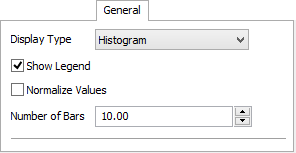
Tracked Variable graphs have the following general properties:
- Display Type - This option changes the display style of graph.
- Show Legend - This option adds a legend to the graph.
- Normalize Values - This option shows the values of the histogram as a percent, rather than an actual value.
- Number of Bars - This option adjust the number of bars that the histogram has.
The Item Trace Tab
The Item Trace tab has the following properties:

Trace Requirements
This picklist allows you to define which flowitems will be traced.
- current: The object as defined in the Objects page.
- item: The involved flowitem.
Item Name
This picklist allows you to define a custom display name for traced items.
- current: The object as defined in the Objects page.
- item: The involved flowitem.
- itemnode: The node associated with the item and its graph data. Setting the name of this node will set the display name in the graph.
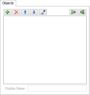
The Objects Tab
There are five ways to add objects to this graph:
- Browse by Class - This method of adding objects sorts the objects by class. To select an entire class, click on the type icon. Click on an object to select or deselect it.
- Browse by Group - This method of adding objects sorts the objects by group. To select an entire group, click on the type icon. Click on an object to select or deselect it.
- Browse by Object - This method of adding objects lists all objects in the model. Click on an object to select or deselect it.
- Select by Dragging - This method of adding objects uses the 3D model view. Simply drag the target icon from the current window to an object in the model you would like to add.
The Objects tab has the following properties:
| Icon | Description |
|---|---|
|
Adds objects or groups to the current list of objects |
|
Removes objects from the current list of objects |
|
Moves the selected object up in the list |
|
Moves the selected object down in the list |
|
Sample an object in the model. |
 |
Combines several objects into one object |
 |
Splits a combined object into its components. |
Display Name
This defines the name of the object or group that will be displayed in the graph. Leaving this field blank will cause the object or group name to be displayed.
State Profile
State Statistics Only. Defines which State Profile should be used. This option is only available if the first object in the object list has additional State Profiles. All objects in the list must have the selected State Profile.
Start Trace On
Gantt Chart (Item Trace) Only. This specifies when a item trace should be started. This value can be set for each individual object.
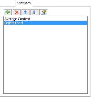
The Statistics Tab
The Statistics tab has the following properties:
| Icon | Description |
|---|---|
|
Adds a statistic to the current list of statistics |
|
Removes a statistic from the current list of statistics |
|
Moves the selected statistic up in the list |
|
Moves the selected statistic down in the list |
Available Statistics
The following statistics are available:
- Output per... - This statistic will measure output per time, where the units of time can be selected from the side list.
- Input per... - This statistic will measure input per time, where the units of time can be selected from the side list.
- Distance Traveled per Time - This statistic will measure the velocity of an object. Both the length units and the time units can be selected from the side lists.
- Total Distance Traveled - This statistic will measure the total distance an object travels. The length units can be selected from the side list.
- Custom - This statistic allows you to execute custom code to define what value is displayed.
The Tracked Variables Tab
The Tracked Variables tab has the following properties:
| Icon | Description |
|---|---|
|
Adds a tracked variable to the current list of tracked variables |
|
Removes a tracked variable from the current list of tracked variables |
|
|
Moves the selected tracked variables up or down in the list |
The Utilization Analysis Tab
The Utilization Analysis tab has the following properties:
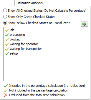
Show All Checked States
This option shows all states as solid colors. It does not calculate the percent time for which the object is utilized.
Show Only Green Checked States
This option shows the percent time that the object is in a green checked state. It does not show any other state information.
Show Yellow Checked States as Translucent
This option shows green checked states in solid green. States with yellow checks are shown in translucent colors.
The Add Button
Manually add states to the list. Some states will not show up automatically in the State List. This is due to objects having a set of 'used' states that may not include states that are set manually through the setstate() command or stopobject() command or through the Time Table or MTBF/MTTR tools. Use the right click menu to remove manually added states from the list.
State List
Valid states for the selected objects will be displayed in this list. Click on the check marks to toggle between the three calculation options.