Pie Chart
Overview and Key Concepts
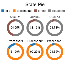
The Pie chart can be used to visualize and compare similar values from many objects. The example below shows the time in state for several objects.
There are two possible formats for the data table for the pie chart. The are described in the following sections.
One Pie per Row
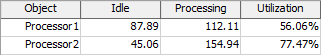
This is the simpler format. The Pie chart assumes that each row in the table represents a single pie chart. You can specify which columns to draw pie segments for. In addition, you can specify which column to use for the title, and which column to display in the center. Here is an example table:
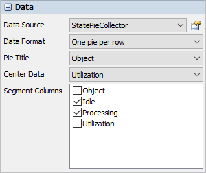
With this data format and table, you can specify the following settings:
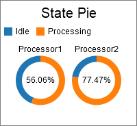
With those settings, the resulting chart would be similar to the following:
One Segment per Row
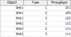
This format is more flexible. In this format, the Pie chart assumes that each row represents a single segment in the pie. You can specify which column determines the segment size, which column determines the color, and which column(s) determine how the segments are grouped. Here is an example table:
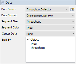
With this data format and table, you can specify the following settings:
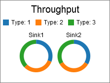
With those settings, the resulting chart would be similar to the following:
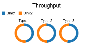
You could alternatively use the following settings, where the Segment Color and Split By options are switched:

This switch in settings creates a chart like the following:
Performance Measures
The Pie Chart provides performance measures in the same way as the Bar Chart. For more information, see the Bar Chart Performance Measures section.
Properties Panels
The Pie Chart uses the following properties panels: