Working With Dashboards and Charts
Using the Toolbox
You'll primarily use the Toolbox to manage dashboards. See Using the Toolbox for general information about working with tool components like dashboards. This topic will explain how to edit and delete dashboards from the Toolbox and other related tasks.
Creating and Renaming a New Dashboard
To create and rename a new dashboard:
- On the main toolbar, click the Dashboards button to open a menu. Select Add a dashboard. The new dashboard will open as a separate pane to the left of the 3D model.
- In Quick Properties in the Dashboard Name box, change the name of your dashboard to accurately represent the kind of content the dashboard will contain.
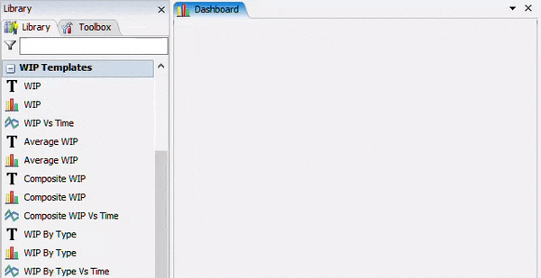
Choosing a Chart
FlexSim provides many easy-to-use chart options in the Dashboard Library. For the most part, these charts are organized by the kind of statistic they display. For example, to view Output data for an object, or for several objects, consider choosing a chart from the Output section.
For each kind of statistic, FlexSim provides several visualization options. For example, you can view an object's content as a Table Chart, a Bar Chart, and as a Time Plot.
Most of the charts in the dashboard library are considered chart templates. See Overview of Chart Templates for a brief description of each chart template. Consider also reading Best Practices When Working With Charts and Types of Charts for guidelines about working with charts and selecting appropriate chart types to visualize your data.
Adding Charts or Model Inputs
You can add charts to a dashboard using several different methods, as explained in the following sections:
Adding Charts from the Library
To add charts or model inputs to a dashboard:
- Make sure the dashboard is the active window so that the Library displays the dashboard charts and widgets.
- Drag a chart or widget from the Library into the dashboard.
- The properties window for charts and chart templates will usually open automatically after they have been added to a dashboard. On the Options tab, you can specify which objects the chart template should gather data from and set any other properties that are specific to that type of chart template. See Selecting Objects for more information.
- You can use the other tabs to change the display settings such as controlling what is displayed in a legend or which colors the chart should use. See Changing Chart Displays for more information.
Adding Charts from the Quick Library
You can also use the Quick Library to add charts or widgets to a dashboard:
- Double-click an area in the dashboard to open the Quick Library.
- Click the chart or widget you want to add to the dashboard. The properties window for charts will usually open automatically when it's been added to a dashboard.
Pinning Statistics to a Dashboard
When you pin a standard statistic to a dashboard, it will automatically generate a statistic collector for that statistic and create a chart in the dashboard. You can change the chart type by adding a different chart type to the dashboard and then linking it to the auto-generated statistics collector. See Viewing Standard Statistics for specific instructions.
Selecting Objects
As was discussed earlier in this topic, you need to know which objects you want to get data from as part of the data-gathering process. The following sections will explain some of the different options that are available:
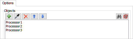
Single Objects
You can gather data from any object in a 3D model or from any process flow activity in a process flow. When you're working with a chart template, you can either sample the object or select the object from a menu.
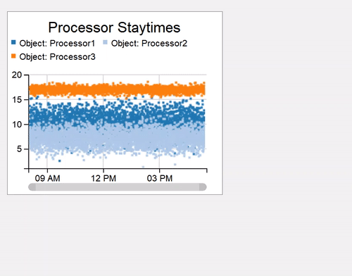
For example, the following chart will gather data from three individual processor objects:
Composite Objects
You'll see the term composite object come up a lot while you're choosing chart templates. In FlexSim, this term is used to describe a set of user-defined objects that mark the beginning and end of an area such as a workstation.
For example, imagine you have modeled a workstation in which flow items move from a queue to a processer, then to a second queue and a second processor:
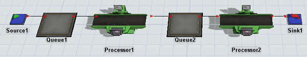
Perhaps you wanted to gather data about how many flow items are circulating through that entire workstation at the same time. In this example, you could set the first queue as the beginning point of the composite object and the second processor as the end point of the composite object:
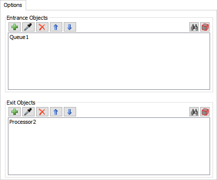
For data collection purposes, these objects and all the objects in between the flow will count as one object. For example, imagine there are 10 items in Queue1, 1 item in Processor1, 5 items in Queue3, and 1 item in Processor2. The total content inside the composite object would be 17 items.
Groups of Objects
You can use groups to create a custom group of objects that you can gather data from at the same time.
For example, imagine you have created a group called MyProcessors that has three processors as members:
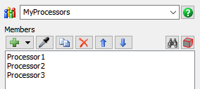
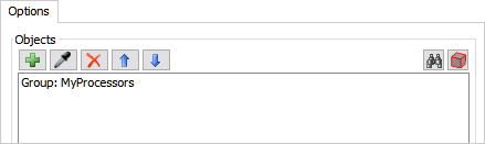
You could then sample the group or select it from the menu to gather data from all three processors at the same time:
Changing Chart Displays
You can change several aspects of the chart's visuals including:
- Font sizes
- Colors (if applicable)
- Chart legends
- And various chart-specific elements
You'll make these changes in the Settings and Colors tab.
Moving or Resizing a Chart
To move or resize a chart:
- Click the chart to select it.
- To move the chart, hover over the edge of the chart until the mouse changes to the directional arrows, then move the chart.
- With the chart selected, click and drag the black sizer boxes to resize it.
Installing a Chart Template
When you use a chart template, FlexSim automatically generates many of the tools that are needed to create the statistics for that template. Various chart templates might create process flows, groups, statistics collectors, or calculated tables. These tools will run invisibly in the background. However, if you would like to make these tools visible, you can install them from the chart template. Installing chart template tools can be a great way for you to study and learn about more advanced data gathering techniques if you'd like to learn how the advanced tools work together in FlexSim.
To install a chart template:
- Double-click the chart to open its properties window.
- On the Advanced tab, click the Install button.
- Check the Toolbox in the left pane and you'll see several new tool components will now appear, depending on the type of chart template that was installed. You can click each individual tool component to view its properties and see how the tools work together to create the statistic you wanted.
Exporting a Chart or Chart Template
If you want to export a chart's data, you should actually export the data table of the statistics collector that is linked to the chart in the background:
- If you're using a chart template, make sure you install it first. (See Installing a Chart Template for more information.)
- Double-click the chart to open its properties window.
- On the Advanced tab, click the Export Data button.
- Navigate to the folder where you would like to save the data and give it an appropriate file name.
If you want to export a chart itself, you can right-click it to open a menu and select Export as PNG to save it as an image file. As an alternative:
- Click the chart to select it.
- Press Ctrl+C to copy it to your computer's clipboard.
- Open an image editing software program and press Ctrl+V to paste the image into a new file.
Setting up a Chart (Advanced)
If you use the basic charts, you'll need to connect those charts to any objects or tools such as data collectors on your own. For that reason, these basic charts are typically used by more advanced users. This section will explain how to set up a basic chart.
Linking a Chart to a Statistics Collector
Every chart needs to be linked to a statistic collector's data table. The data table will provide the raw data that will be visualized by the chart. You can also link the data to a calculated table if needed.
To link a chart to a statistics collector:
- Double-click the chart to open its properties window.
- In the Data tab, click the Data Source menu and select a statistics collector or calculated table from the menu. If there are currently no statistics collectors available, you can select Add a New Statistics Collector.
- If needed, press the ... next to the Data Source menu to open the collector's properties.
Setting Up the Chart Data
After you've linked a chart to a statistic collector, you'll need to tell the chart which columns from the data table should be used to create the chart's elements. These settings are found on each chart's Data tab.
In general, a lot of the chart settings will depend on the columns you created in a collector's data table. Once you've linked a statistics collector to a chart, its columns will show up as possible options that can be included in the chart's elements. So make sure that you have a good understanding of the names and values of the charts in the collector's data table.
The chart's settings will vary based on the specific type of chart you are creating. For specific information about each chart's settings and properties, refer to that chart's reference page. See Types of Charts for links to each chart's reference page.