Process Flow General Properties
Overview and Key Concepts
Each process flow that you create in FlexSim has several general properties (settings) that affect the behavior of its activities and tokens. You can access and edit a process flow's general properties by clicking on an empty area somewhere in the process flow (so that nothing else is selected). The general properties will appear in the Quick Properties pane, as shown in the following image:
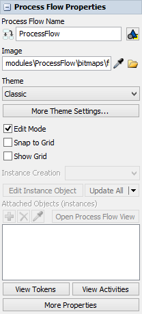
Process Flow Properties
Each of these properties will be explained in the following sections.
Process Flow Name
You can use this box to change the name of the current process flow. Simply click in the box and type a new name. By default, the name of the first process flow will be ProcessFlow. Subsequent process flows will be named ProcessFlow1, ProcessFlow2, etc.
Changing the name here will change the name that displays on the process flow's tab and also in the Toolbox.
Image
The Image box sets the icon image for the process flow. This icon is displayed on the tab
of the process flow and in the Toolbox. By default, all process flows use the flowchart icon
 .
.
To change the icon, you can click the Browse button
 to navigate to the icon file in
your computer.
to navigate to the icon file in
your computer.
Theme
A theme is a group of visual settings that can be applied to an entire process flow. A theme can affect:
- The color of the background, activities, shared assets, tokens, etc.
- The styles of the connectors
- The font and style of the fonts
- The color and visual functionality of the containers (flow chart objects)
See Changing Process Flow Visuals for more information.
More Theme Settings
Use the More Theme Settings button to open the Process Flow Visual Theme properties window. See Process Flow Visual Theme Properties for an explanation of its properties.
Edit Mode
The Edit Mode checkbox turns on and off the Edit Mode, which changes the Process Flow to be more user friendly for simply running a model. Turning Edit Mode off is mainly intended for use after creating a Process Flow. It will hide variables that are not set as User Accessible and it will make it so the default action when selecting a Process Flow is to open its properties window and not the model view window.
Snap to Grid
The Snap to Grid checkbox turns snapping to the grid on and off. By default, activities and display objects will automatically align to one another as they are being dragged. The grid offers an additional mechanism to neatly lay out objects.
Show Grid
The Show Grid checkbox displays or hides the grid.
View Tokens
You can click the View Tokens button to open a window where you can see an overview of all tokens during a simulation run. The View Tokens window shows the labels and details associated with all the tokens in the Process Flow. This is particularly useful for troubleshooting your process flow. See Troubleshooting Process Flows for more information.
View Activities
You can click the View Activities button to open window where you can see an overview of all the activities in your process flow. You can also use this window to change the statistics settings of the activities in the Process Flow and to set up tracing options, which can help with troubleshooting your process flow. See Troubleshooting Process Flows for more information.
More Properties
You can click the More Properties button to open additional general properties for this process flow. You can use this window to set the variables used in the Process Flow as well as visual settings, labels, and triggers.
Process Flow Instances
This group of properties controls process flow instances. This group of properties is not available for General Process Flows. See Process Flow Instances for more information about instances and related concepts.
Instance Creation
The Instance Creation menu is only available on process flows that are using the Sub Flow type. This menu defines when the FlexSim system will create an instance of a sub flow. This can possibly affect whether shared assets (Resources, Lists, and Zones) are global or local to instances. The menu has the following options:
- Global - If this option is selected, there will only be one instance of a sub flow running at a time. All shared assets will be shared within that sub flow.
- Per Instance - In this context, an instance refers to an object that is running the sub flow. So, for example, if two processors are using the same sub flow, each processor would be considered a separate instance. By default, when you select this option all shared assets will be local to each instance, meaning they won't share assets.
- Per Block - You might have activity blocks that each have a Run Sub Flow activity in them. Each Run Sub Flow activity might be connected to the same sub flow. When this option is selected, each activity block that runs a sub flow would be considered a separate instance. By default, when you select this option all shared assets will be local to each instance, meaning they won't share assets.
- Per Token - When this option is selected, each token that runs inside the sub flow will be a separate instance. By default, when you select this option all shared assets will be local to each instance, meaning they won't share assets.
Attached Objects
You will use the Attached Objects properties to add, remove, and display attached instance objects. These options are only available for the Sub Flow, Fixed Resource, and Task Executer types of process flows. See Types of Process Flows for more information.
Process Flow Views
Use these properties to create pre-set views of certain areas in your process flow. These properties function similarly to the Model View settings.
Labels
Use these settings to add labels to the process flow.
Capture View
Use these settings to set up a screen capture of a process flow.
Process Flow Visual Theme Properties
The properties that are available in the Theme dialog box are shown in the following image:
For your reference, each property will be explained in the following sections:
Themes
You can use this menu to create your own custom theme.
Apply Theme To Objects
This button that applies the theme to previously created objects within the Process Flow.
Default Connector Properties
These properties affect the way connections are drawn between activities. See Adding and Connecting Activities for more information about connectors.
- Type - You can select different arrow styles from this menu. In this version of FlexSim, the two available styles are straight and Bezier. Future FlexSim versions might have more styles.
- Width - Sets the width of the connector's line.
- Style - You can select the connector's line style (such as a solid, dashed, or dotted line) from this menu.
- Start Cap - You can use this menu to select the visual style of the start of the connector. You can give the start of the line a shape such as a square, a circle, or another arrowhead.
- End Cap - Similar to the Start Cap menu, you can use this menu to select the visual shape at the end of the connector.
Default Text Properties
These properties affect the style of the text in a process flow. It will affect text such as the name of containers or any other display text that has been added. NOTE: Changing the text settings here will not affect the text in activities, which is affected by the Default Activity Properties.
- Font - The font menu has 13 common fonts available.
- Size - Changes the font size.
- Style - You can make the text bold, italicized, or underlined.
- Color - You can change the color of the text by
using the color selector or using the Sampler button
 to select a color from any object in
your simulation model or process flow.
to select a color from any object in
your simulation model or process flow. - Color Alpha - This slider changes the transparency of the text.
- Outline - If you check the Outline checkbox, text
objects will appear to have a border around them. There are a variety of properties you
can use to change the border display:
- Style - Changes the line style of the border.
- Thickness - Changes the thickness of the border.
- Color Selector - You can change the color
of the border by using the color selector or using the Sampler button
to select a color from any
object in your simulation model or process flow.
- Color Alpha - This slider changes the transparency of the border.
Default Container Properties
These properties affect the style for containers such as flowchart objects.
- Hide Contents at Magnification - You can specify a zoom level where when you zoom out further than that level the contents of this container will be hidden.
- Fill - When the Fill checkbox is cleared, you will
only be able to select the flow chart by clicking on its edge. This setting allows you
to prevent clicking and selecting the background flow chart on accident. If you want to
be able to click anywhere inside the flow chart object, check the Fill box. When the box
is checked, the following properties will become available:
- Color - Change the color of the flow chart
object's background by using the color selector. Alternatively, you can use the
Sampler button to select a color
from any object in your simulation model or process flow.
- Alpha - This slider changes the transparency of the flow chart object.
- Color - Change the color of the flow chart
object's background by using the color selector. Alternatively, you can use the
Sampler button
- Outline - If you check this checkbox, the border
of the Flow Chart object will be visible. There are a variety of properties you can use
to change the border display:
- Single or Double - Use these options to switch to from a solid black line or a double line (which looks like it has a white stripe running through it).
- Width - Sets the border's width.
- Style - Changes the line style of the border.
- Thickness - Changes the thickness of the border.
- Color - You can change the color of the
border by using the color selector or using the Sampler button
to select a color from any
object in your simulation model or process flow.
- Alpha - This slider changes the transparency of the border.
Default Activity Properties
It has the following properties:
- Set Activity Size - If you check this property you
will be able to specify the size of activities. When this box is checked, the following
properties become available:
- X - Sets the default width of activities.
- Y - Sets the default height of activities.
- Activity Color - You can change the color of the
activities by using the color selector or using the Sampler button
to select a color from any object in
your simulation model or process flow.
- Resource Color - You can change the color of the
shared assets by using the color selector or using the Sampler button
to select a color from any object in
your simulation model or process flow.
- Alpha - Sets the transparency for resources.
- Font - These properties control the text on
activities and resources:
- Font - The font menu has 13 common fonts available.
- Size - Changes the font size.
- Style - You can make the text bold, italicized, or underlined.
- Color - You can change the color of the
text by using the color selector or using the Sampler button
to select a color from any
object in your simulation model or process flow.
The Process Flow Properties Window
When you click the More Properties button on the process flow's general properties in Quick Properties, it opens a window with additional process flow properties. It has has four tabs with several properties:
- The Variables Tab - You will use this tab to create Process Flow Variables. See Process Flow Variables for more information.
- The Visualization Tab - Controls the appearance of tokens and activity links in a process flow. See The Visualization Tab in the following section for a full explanation of the properties on this tab.
- The Labels Tab - This tab is identical to the Labels group in Quick Properties. Any changes you make here will show up in Quick Properties and vice versa. See Labels for more information.
- The Triggers Tab - Use this tab to add any triggers to the process flow. Only the On Reset and On Message triggers are available.
The Visualization Tab
The Visualization tab can control the visual appearance of tokens and activity links in a process flow, which can be helpful for trouble-shooting and visualizing logic. The properties that are available in the Visualization tab are shown in the following image:
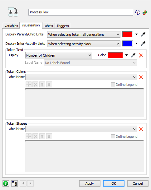
Each property will be explained in the following sections:
Display Parent/Child Links
Use the Display Parent/Child Links menu to control how links between parent and child tokens will be displayed in the process flow. (See Sub Process Flows for an explanation of parent and children tokens.)
Use the color selector next to the menu to determine the color of the link that will be drawn between parent and children tokens.
This menu has the following options:
- When selecting token: all generations - When you click on a token during a simulation run, you'll see a thin line between the parent and any of its children tokens, grandchildren tokens, etc. This option is the default.
- When selecting token: one generation - When you click on a token during a simulation run, you'll see a thin line between the parent and any of its children tokens but not its grandchildren tokens.
- Never display - The links between parent and children tokens will never be displayed.
- Always display - The links between parent and children tokens will always be displayed, even when a token is not selected.
Display Inter-Activity Links
Use this menu to control how links between activities will be displayed in the process flow. Links are different from connectors. Links are logical connections between activities that do not necessarily control how tokens flow from one activity to another.
Any shared asset activities usually require an inter-activity link. For example, the Acquire Resource activity will usually be linked to a Resource activity so that it can get permission to access that resource if it is available.
Any activities that initiate a sub flow will require an inter-activity link. For example, Create Tokens and Run Sub Flow activities are usually linked to activities on a sub flow. (See Sub Process Flows - Linking to Sub Flows for more information.)
Use the color selector next to the menu to determine the color of the link that will be drawn between linked activities.
This menu has the following options:
- When selecting activity block - When you click on a linked activity, you'll see a thin line between the linked activities. This option is the default.
- Allow Toggling - You can manually show or hide a
thin line between the linked activities directly in your process flow. To show or hide
the links, select the activity block and click on the Eye symbol
 to switch between hiding and showing.
 - Never display - Inter-activity links will never be displayed.
- Always display - Inter-activity links will always be displayed.
Token Text
Use the Display menu in the Token Text group to determine what text will display inside tokens during a simulation. The menu has the following options:
- Number of Children - If a token has children tokens, it will display how many children it currently has, as shown in the following image:
- Label Value - The token will display the value of a label. Use the Label Name menu to select the label that the token will get the value from.
- Custom - The token will display custom information. Use the Custom box to select the information that will be displayed.

Use the color selector to determine the color of the text that will display inside the token.
Token Colors
You can use these settings to dynamically change the color of tokens during a simulation run based on a label value. For example, in the following image, the tokens will each have a different color based on the value in the itemType label:
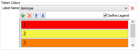
The Label Name menu sets the label that you will use to define the color scheme for the tokens in the Process Flow. It will dynamically search for any labels that exist in the process flow.
If the Define Legend checkbox is checked, you will be able to set the colors
that will be associated with certain values on the label. Click the Add button
 to add a color. Click inside the newly added
color to change the color or the value it should be associated with in the label.
to add a color. Click inside the newly added
color to change the color or the value it should be associated with in the label.
Token Shapes
You can use these settings to dynamically change the shape of tokens during a simulation run based on a label value. For example, in the following image, the tokens will each have a different shape based on the value in the itemType label:
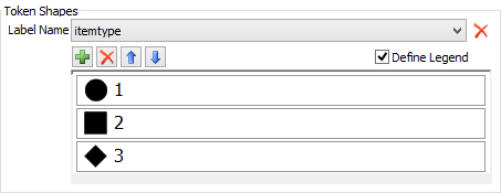
The Label Name menu sets the label that you will use to define the shapes for the tokens in the Process Flow. It will dynamically search for any labels that exist in the process flow.
If the Define Legend checkbox is checked, you will be able to set the shapes
that will be associated with certain values on the label. Click the Add button
to add a shape. Click inside the newly added
shape to change the shape or the value it should be associated with in the label.