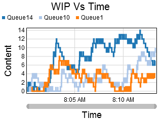
Time Plot
Overview and Key Concepts
The time plot chart allows you to create scatter plots, line charts, and stair-step plots of the data in any StatisticsCollector.
The Data Tab
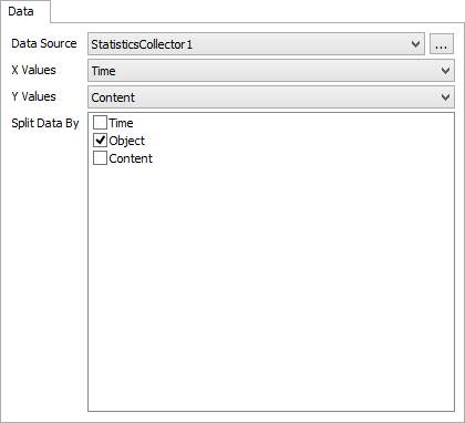
The data tab has the following properties:
- Data Source - Choose a valid data source from the drop down list. All Statistics Collectors and Calculated Tables are shown. You can also choose the last option to create a new Statistics Collector. You can click the accompanying button to open the properties window for the selected data source.
- X Values - Choose a column from the data source that contains the x-axis values you wish to plot. This column cannot contain text. If this column is formatted as Date / Time, then the x axis will become a time axis.
- Y Values - Choose a column from the data source that contains the y-axis values you wish to plot. This column cannot contain text. If this column is formatted as Date / Time, then the y axis will become a time axis.
- Split Data By - Optional. These columns are used to categorize each data point. Each unique combination of values in the Split Data By list becomes a new category, and each category is marked with a different color. In this way, you can specify multiple series in a single table.
The Settings Tab
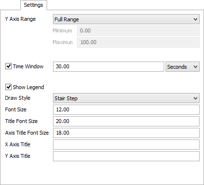
The settings tab has the following properties:
- Y Axis Range - Select the desired range for the Y axis. There are 3 available options:
- Full Range - The range of the Y axis will always include the complete range of data.
- Adaptive Range - The range of the Y axis will adapt to the visible data.
- Fixed Range - The range of the Y axis is set according to the Minimum and Maximum values
- Time Window - If checked, the chart will keep only the most recent time period in view. You can specify the desired time to keep in view.
- Show Legend - Check this box to show the legend. Clear the box to hide the legend.
- Draw Style - Choose how data points are connected.
There are three options for this property:
- Points - each x/y pair is drawn as a point on the chart.
- Line - each x/y pair is connected by a line.
- Stair Step - each x/y pair is connected by a horizontal line, followed by a vertical line.
- Font Size - Set the font size for general text on this chart in pixels.
- Title Font Size - Set the font size for the chart title in pixels.
- Axis Title Font Size - Set the font size for the axis titles in pixels.
- X Axis Title - Optional. Specify the text for the x-axis title.
- Y Axis Title - Optional. Specify the text for the y-axis title.
The Colors Tab
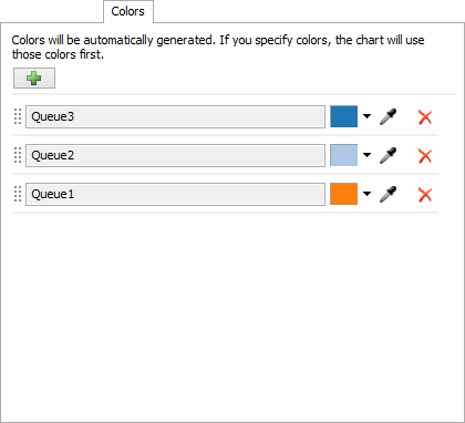
This tab allows you to specify the colors for each line on the chart. Each category of data will get a new color, based on the Split By options. As more colors are required, the chart will generate a color and assign color to a category. Once this is done, you can change the color for each color. Alternatively, you can add colors to the chart, before the colors are required. The chart will use the specified colors, assigning them to a category, before generating new colors.
The colors tab has the following properties:
- Add Color
 - Allows
you to add additional colors to the chart.
- Allows
you to add additional colors to the chart.
- Color List - This list shows what colors the chart is using, and what categories they are assigned to. You can use the dropdown arrow or the sampler button to choose a new color for each category.
Performance Measures
The Time Plot provides aggregations of the Y Values column as performance measures. Possible aggregations include:
- Average
- Sum
- Minimum
- Maximum
- Last Value
- Time-Weighted Average
If any columns are marked as Split By columns, then for each unique split-by value, the chart will provide the same aggregations, but filtered exclusively for the split-by value.