The Settings Panel
Overview
The Settings panel displays different chart options depending on the type of chart.
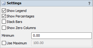
Bar Chart Settings
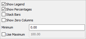
The settings panel for bar charts has the following properties:
Show Legend
Check this box to show the legend. Clear the box to hide the legend.
Show Percentages
Check this box to show the bar chart in percentage mode, rather than by raw value. If this box is cleared, then the x-axis will switch to raw value mode
Stack Bars
Check this box to display the bars stacked horizontally. Clear this box to show each bar side by side.
Show Zero Columns
Check this box to display legend items for all columns. Clear this box to show only columns where at least one row has data, which implies only showing legend items for visible bars.
Minimum
Specifies the minimum value for this chart. The value should be non-negative.
Use Maximum
If checked, the chart will use the supplied maximum value, rather than determining the maximum automatically.
Box Plot Settings
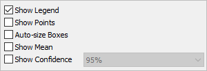
The settings panel for box plots has the following properties:
Show Legend
Check this box to show the legend. Clear the box to hide the legend.
Show Points
Check this box to show the data points used to generate the box plot. If this box is checked, the points will be drawn in the category color, while the box plot will be drawn gray.
Auto-size Boxes
Check this box to adjust the width of each box, making it more proportional to the height. Clear this box to have all boxes be equally wide.
Show Mean
Check this box to show the mean of the values on the chart.
Show Confidence
Check this box to show the range of the confidence interval about the mean. You can use the combobox to choose the level of confidence.
Financial Analysis Chart Settings
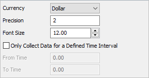
The settings panel for financial analysis charts has the following properties:
Currency
This options changes the prefix of each value to be displayed. The Other option allows you to define a custom string value, or leave the field blank to display no prefix.
Precision
This defines how many numbers will be displayed right of the decimal point.
Font Size
This defines the font size of graph text.
Only Collect Data for a Defined Time Interval
This option creates a time period during which statistics for this graph will be recorded.
From Time
This defines when statistics will start being recorded.
To Time
This defines when statistics will no longer be recorded.
Gantt Chart Settings
The settings panel for gantt charts has the following properties:
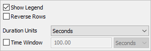
Show Legend
Check this box to show the legend. Clear the box to hide the legend.
Reverse Rows
When checked, the chart draws the most recent rows at the top.
Duration Units
Specifies the units for the duration shown in the hover information.
Time Window
When checked, the chart automatically adjusts the horizontal scroll to show only the most recent time period, which you must specify when using this option.
Histogram Settings
The settings panel for histograms has the following properties:
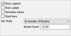
Show Legend
Check this box to show the legend. Clear the box to hide the legend.
Show Labels
Check this box to show the value of each bar at the top of the bar.Clear the box to hide the value labels.
Normalize Values
Check this box to show each bar as a percentage of the total, rather than the raw count. Clear this box to show each bar as the count for that range.
Stack Bars
Check this box to show different data sets stacked.
Bar Mode
Choose how bucket boundaries are generated. There are several options for this property:
- By Number of Buckets - With this option, you must specify how many Buckets will exist on the chart. There will be one bar per bucket, per category.
- By Bucket Width - With this option, you must specify how wide each bucket will be, and where the buckets start from.
- Sturges' Rule - Uses Sturges' rule to determine the number of buckets.
- Scott's Rule - Uses Scott's rule to determine the number of buckets.
- Freedman-Diaconis Rule - Uses the Freedman-Diaconis rule to determine the number of buckets.
The last three options are well-known methods for choosing the width of each bucket. More information on each can be found on sites such as Wikipedia.
Pie Chart Settings
The settings panel for pie charts has the following properties:
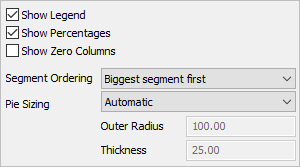
Show Legend
Check this box to show the legend. Clear the box to hide the legend.
Show Percentages
Check this box to show the pie chart in percentage mode, rather than by raw value. This only changes the center text. If this box is cleared, then the center text will switch to raw value mode.
Show Zero Columns
Check this box to display legend items for all columns. Clear this box to show only columns where at least one row has data, which implies only showing legend items for visible colors.
Segment Ordering
Select how segments in the pie are ordered. The available options are:
- Biggest segment first - The pie chart will order the segments by size.
- Use order in table - The pie chart will order the segments as they are orderd in the table.
Pie Sizing
Choose how the pie will be sized. The available options are:
- Automatic - The size of each pie will be determined by the length of the center text, if any.
- Fixed values - The chart will use the specified values.
Outer Radius
If the Pie Sizing property is set to Fixed values, then this value specifies the distance from the center of the pie to the outermost part of the pie.
Thickness
If the Pie Sizing property is set to Fixed values, then this value specifies the distance from the outermost part of the pie to the innermost part of the pie. To fill the pie all the way to the center, make this value the same as the Outer Radius property.
Sankey Diagram Settings
The settings panel for sankey diagrams has the following properties:
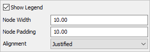
Show Legend
Check this box to show the legend. Clear the box to hide the legend.
Node Width
Specify the width of each node (represented as a rectangle) in the diagram. This value should be greater than zero.
Node Padding
Specify the vertical space between nodes. This value should be greater than zero.
Alignment
Specify which alignment used for the chart layout. There are four possible options:
- Justified - Nodes without incoming links are pushed to the left edge. Nodes without outgoing links are pushed to the right edge.
- Left - Nodes without incoming links are pushed to the left edge. Nodes without outgoing links are moved as far to the left as possible.
- Right - Nodes without incoming links are pushed as far to the right as possible. Nodes without outgoing links are pushed to the right edge.
- Centered - Nodes without incoming links are pushed as far to the right as possible. Nodes without outgoing links are pushed as far to the left as possible.
Time Plot Settings
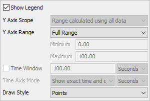
The settings panel for time plots has the following properties:
Show Legend
Check this box to show the legend. Clear the box to hide the legend.
Y Axis Scope
Select how the range for each Y axis is determined. There are two possible values:
- Range calculated using all data - Each Y axis will be calculated using all data from the entire table. This option ensures that all Y axeswill have the same scale and offset.
- Range calculated using data within axis - Each Y axis will be calculated using only the data that belongs to that axis. The option ensures that each Y axis will have the location and scale required to show only the data on that axis.
Y Axis Range
Select the desired range for the Y axis. There are three available options:
- Full Range - The range of the Y axis will always include the complete range of data.
- Adaptive Range - The range of the Y axis will adapt to the visible data.
- Fixed Range - The range of the Y axis is set according to the Minimum and Maximum values
Time Window
If checked, the chart will keep only the most recent time period in view. You can specify the desired time to keep in view.
Time Axis Mode
You can specify whether to show the exact calendar time, or the duration from the start of the model on the time axis. If you choose to show duration, you can specify the time units that the time axis will show.
Draw Style
Choose how data points are connected. There are five options for this property:
- Points - each x/y pair is drawn as a point on the chart.
- Line - each x/y pair is connected by a line.
- Lines and Points - each x/y pair is connected by a line, and is drawn as a point on the chart.
- Stair Step - each x/y pair is connected by a horizontal line, followed by a vertical line.
- Area - the sequence of x/y pairs is used to create a filled shape.