The Data Panel
Overview
The Data panel displays different chart options depending on the type of chart.
Bar Chart Data
The data panel for bar charts has the following properties:
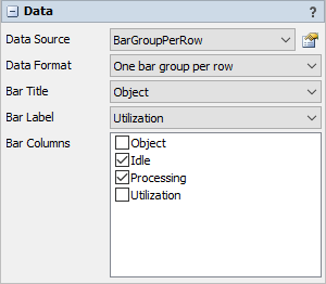
Data Source
Choose a valid data source from the drop down list. All Statistics Collectors and Calculated Tables are shown. You can also choose the last option to create a new Statistics Collector. You can click the accompanying button to open the properties window for the selected data source.
Data Format
Choose a data format. For more information on data formats, see Bar Chart Overview.
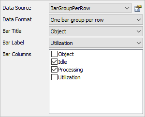
If the Data Format property is set to One bar group per row, then the data panel has these additional properties:
Bar Title
Choose a column from the data source that contains the values you want to use as the title of each row. If you select the first option, for None, then no text will be displayed on the Y axis.
Bar Label
Choose a column from the data source that contains the values you want to show as additional text on this row.
Bar Columns
Choose which columns will be included in the bar chart. If the bar chart is showing percentages, the percentage is calculated from the selected columns only. Each included column must not contain text.
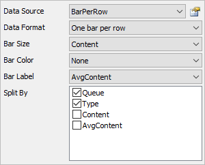
If the Data Format property is set to One bar per row, then the data panel has these additional properties:
Bar Size
Choose a column that determines the size of the bar. This column should contain number data.
Bar Color
Optional. Choose a column that determines the color of the bar.
Bar Label
Optional. Choose a column that displays data left of the bar. This column should contain the same value for all rows in the same bar group.
Split By
Optional. For each Split By column specified, the bar chart will make one bar group per unique combination of values in those columns.
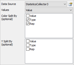
Box Plot Data
The data panel for box plots has the following properties:
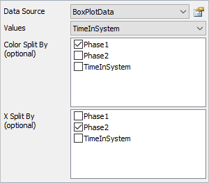
Data Source
Choose a valid data source from the drop down list. All Statistics Collectors and Calculated Tables are shown. You can also choose the last option to create a new Statistics Collector. You can click the accompanying button to open the properties window for the selected data source.
Values
Choose a column from the data source that contains the values you wish to analyze using the boxplot. This column should only contain numeric data.
Color Split By
Optional. These columns are used to categorize each data point by color. Each unique combination of values in the list becomes a new category, and each category is marked with a different color.
X Split By
Optional. These columns are used to categorize each data point by axis. Each unique combination of values in the list becomes a new category, and each category is shown on a different part of the x axis.
Gantt Chart Data
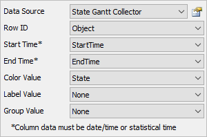
The data panel for gantt charts has the following properties:
Data Source
Choose a valid data source from the drop down list. All Statistics Collectors and Calculated Tables are shown. You can also choose the last option to create a new Statistics Collector. You can click the accompanying button to open the properties window for the selected data source.
Row ID
Choose a column from the data source that contains the values you want to use as the Row ID. Each unique value in this column will correspond to a new row.
Start Time
Choose a column from the data source that contains the start time for the box on the gantt chart. This column must have FlexSim time data in it.
End Time
Choose a column from the data source that contains the end time for the box on the gantt chart. This column must have FlexSim time data in it.
Color Value
Choose a column from the data source that contains the value for the box on the gantt chart. Each unique value is assigned a unique color.
Label Value
Optional. If selected, data from the specified column will be printed on each box, if the box is big enough.
Group Value
Optional. If selected, data from the specified column will be used to group the boxes. If you click on a box in the chart, all boxes with the same group value will be highlighted.
Histogram Data
The data panel for histograms has the following properties:
Data Source
Choose a valid data source from the drop down list. All Statistics Collectors and Calculated Tables are shown. You can also choose the last option to create a new Statistics Collector. You can click the accompanying button to open the properties window for the selected data source.
Values
Choose a column from the data source that contains the values you wish to be counted as part of the histogram. This column cannot contain text.
Color Split By
Optional. These columns are used to categorize each data point by color. Each unique combination of values in the list becomes a new category, and each category is marked with a different color.
Y Split By
Optional. These columns are used to categorize each data point by axis. Each unique combination of values in the list becomes a new category, and each category is shown on a different y axis.
People Templates Data
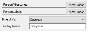
The data panel for people templates has the following properties:
Tables
The Tables section shows a list of the tables this template depends on. The first table in the list contains the data required for the metric. Any additional tables contain data that may be useful for creating Subsets or Partitions.
Next to each table in the list, there is a View Table button. Click this button to open the properties window for that table. This view will allow you to see the data recorded in each table. For more information, see the People Statistics Table Properties topic.
Metric Options
The Metric Options section will contain any options about the metric used by the current template. Some common options are:
- Display Name - Most templates allow you to edit the Display Name of the metric, which appears in various locations on the chart.
- Time Units - Metrics involving durations will usually allow you to change the time units of the metric.
- Units - Metrics involving distances will usually allow you to change the distance units of the metric.
- Edit Person/Location/Staff/etc. states - State templates will usually provide a button to that opens the People Settings properties so you can edit the Person/Location/Staff/etc. states. For more information, see the People Settings topic.
- Value Mode - Specifies how to display data for each state column. If the value mode is set to percentage, then the value displays the percent time spent in a given state. If the value mode is set to duration, the chart will show the average time spent in that state.
- Location Display - Specifies the name of the WaitForLocation column
- Staff Display - Specifies the name of the WaitForStaff column
- Equipment Display - Specifies the name of the WaitForEquipment column
- Transport Display - Specifies the name of the WaitForTransport column
Milestones
The Milestone people templates will display milestone options at the bottom of this panel.
For Milestone Intervals see the Intervals section.
The Average Milestone Times chart displays the following table:
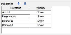
Use this table to determine whether or not to show each milestone, and what order to show the miltestones in.
Pie Chart Data
The data panel for pie charts has the following properties:
Data Source
Choose a valid data source from the drop down list. All Statistics Collectors and Calculated Tables are shown. You can also choose the last option to create a new Statistics Collector. You can click the accompanying button to open the properties window for the selected data source.
Data Format
Choose a data format. For more information on data formats, see the Pie Chart Overview.
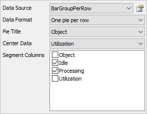
If the Data Format property is set to One pie per row, then the data panel has these additional properties:
Pie Title
Choose a column from the data source that contains the values you want to use as the title of each row. If you select the first option, for None, then no text will be displayed above the pie.
Center Data
Choose a column from the data source that contains the values you want to show in the center of each pie. If you select the first option, for None, then no text will be displayed in the center of each pie.
Segment Columns
Choose which columns will be included in the pie chart. The segment size is calculated relative to the selected columns only. Each included column must not contain text.
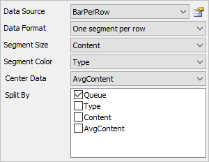
If the Data Format property is set to One segment per row, then the data panel has these additional properties:
Segment Size
Choose a column that determines the size of the pie segment. This column should contain number data.
Segment Color
Optional. Choose a column that determines the color of the segment.
Center Data
Optional. Choose a column that displays data in the center of the pie. If there are multiple rows for the same pie, then the last value for that pie will be used.
Split By
Optional. For each Split By column specified, the pie chart will make one pie per unique combination of values in those columns.
Sankey Diagram Data
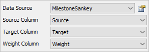
The data panel for sankey diagrams has the following properties:
Data Source
Choose a valid data source from the drop down list. All Statistics Collectors and Calculated Tables are shown. You can also choose the last option to create a new Statistics Collector. You can click the accompanying button to open the properties window for the selected data source.
Source Column
Choose a column from the data source that contains the source values you wish to use. This column can contain text or number data. If this column contains number data, the display format for that column should either be Raw or Object. Text data is also acceptable. The display format of the selected column should match the display format of the target column. For more information on number formats, see the discussion about Display formats in the Columns section of the Statistics Collector Columns Tab topic.
Target Column
Choose a column from the data source that contains the target values you wish to use. This column can contain text or number data. If this column contains number data, the display format for that column should either be Raw or Object. The display format of the selected column should match the display format of the source column.
Weight Column
Choose a column from the data source that contains the weight values you wish to use. This column should contain number data. The value in this column is used to determine the thickness of each link.
Scenario Chart Data
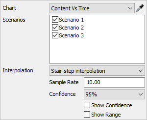
The data panel for scenario charts has the following properties:
Chart
Select which chart the Scenario Chart will be based on. You can select a chart from the list, or use the sampler.
Scenarios
Select which scenarios you would like to compare on the same chart.
Additional properties may appear on the data tab, depending on the specified chart. These are described in the following sections:
Time Plot
If a time plot is specified, the following properties will appear:
- Interpolation - Select how the Scenario
Chart will interpolate between replication values. There are three possible
values:
- None - The Scenario chart does not calculated the mean; it displays all values from all replications, colored by scenario.
- Stair-Step - In order to calculate the mean value over time, the Scenario chart samples all replication values at specific points in time. If a given replication doesn't have a value recorded at that point in time, the scenario chart will use the newest value that is previous to the sample time.
- Linear - In order to calculate the mean value over time, the Scenario chart samples all replication values at specific points in time. If a given replication doesn't have a value recorded at that point in time, the scenario chart will linearly interpolate between existing data.
- Confidence - Specifies the value level of confidence to use if confidence is shown.
- Show Confidence - Check this box to have the Scenario Chart calculate and display the confidence interval vs. time.
- Show Range - Check this box to have the Scenario Chart calculate and display the min and max value vs. time.
Table Chart
If a table chart is specified, the following properties will appear:
- Aggregate Columns - Select which columns will be aggregated. The values in the other columns will be used to group rows together for aggregation.
- Show Mean - Check this box to display the mean value of the aggregated columns.
- Show Min - Check this box to display the minimum value of the aggregated columns.
- Show Max - Check this box to display the maximum value of the aggregated columns.
Bar Chart
If a bar chart is specified, the following properties will appear:
- Aggregate title value - Check this box if the text shown as the title value on the bar chart should be aggregated.
- Aggregate bar value - Check the box if the text shown as the bar value should be aggregated.
Pie Chart
If a pie chart is specified, the following properties will appear:
- Aggregate title value - Check this box if the text shown as the title value on the bar chart should be aggregated.
- Aggregate center value - Check the box if the text shown as the center value should be aggregated.
Table Chart Data
The data panel for table charts has the following properties:
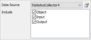
Data Source
Choose a valid data source from the drop down list. All Statistics Collectors and Calculated Tables are shown. You can also choose the last option to create a new Statistics Collector. You can click the accompanying button to open the properties window for the selected data source.
Include
Choose which columns will be included in the table.
Time Plot Data
The data panel for time plots has the following properties:
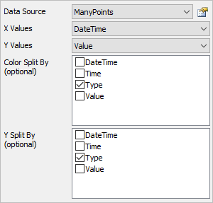
Data Source
Choose a valid data source from the drop down list. All Statistics Collectors and Calculated Tables are shown. You can also choose the last option to create a new Statistics Collector. You can click the accompanying button to open the properties window for the selected data source.
X Values
Choose a column from the data source that contains the x-axis values you wish to plot. This column cannot contain text. If this column is formatted as Date / Time, then the x axis will become a time axis.
Y Values
Choose a column from the data source that contains the y-axis values you wish to plot. This column cannot contain text. If this column is formatted as Date / Time, then the y axis will become a time axis.
Color Split By
Optional. These columns are used to categorize each data point by color. Each unique combination of values in the list becomes a new category, and each category is marked with a different color.
Y Split By
Optional. These columns are used to categorize each data point by axis. Each unique combination of values in thelist becomes a new category, and each category is shown on a different y axis.