Staff Avg State Table Template
Overview and Key Concepts
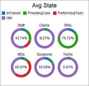
This chart template creates a pie chart, and calculates utilization based on each object's time in various states.
The Tables/Metrics Tab
The tables/metrics tab is used by many Staff State templates. For more information, see the Staff Avg State Table topic.
The Options Tab
The options tab has the following properties:
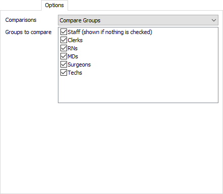
- Comparisons -
Choose what kind of comparisons you would like to see on
this chart. There are four possible options:
- None - Show data for all Staff objects
- Compare Groups - Choose which groups you would like to compare in the table. Each selected group will appear in the table in the Subset column.
- Compare hours of the day - Compare utilization across different hours.
- Compare days of the week - Compare utilization across different days of the week.
The Settings Tab
The settings tab is identical to the Pie Chart's settings tab. For more information, see the Pie Chart topic.
The Text Tab
The text tab is identical to the Pie Chart's text tab. For more information, see the Pie Chart topic.
The Colors Tab
The colors tab is identical to the Pie Chart's colors tab. For more information, see the Pie Chart topic.
The Advanced Tab
This template, like all templates, uses the Advanced Tab. For more information, see Advanced Tab.