Sankey Diagram
Overview and Key Concepts
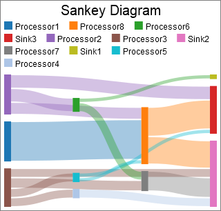
The Sankey Diagram allows you to visualize flow between various points in a system.
Data Format
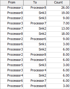
This chart assumes that each row of the Data Source contains information about individual links. One column will have a Source value, another will have a Target value, and a third will have a Weight value. The Target and Source values are used to determine the location of the link. The Weight value will determine the thickness. Here is the table for the chart shown above:
The Data Tab
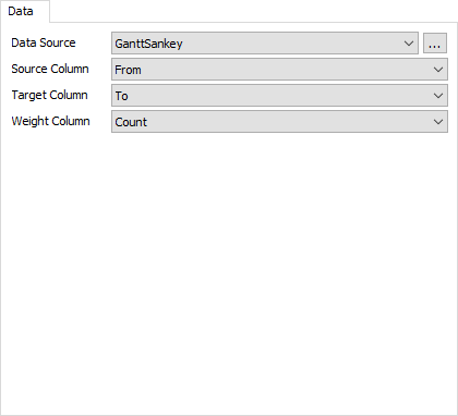
The data tab has the following properties:
- Data Source - Choose a valid data source from the drop down list. All Statistics Collectors and Calculated Tables are shown. You can also choose the last option to create a new Statistics Collector. You can click the accompanying button to open the properties window for the selected data source.
- Source Column - Choose a column from the data source that contains the source values you wish to use. This column can contain text or number data. If this column contains number data, the display format for that column should either be Raw or Object. Text data is also acceptable. The display format of the selected column should match the display format of the target column. For more information on number formats, see the discussion about Display formats in the Columns section of the Statistics Collector Data Tab topic.
- Target Column - Choose a column from the data source that contains the target values you wish to use. This column can contain text or number data. If this column contains number data, the display format for that column should either be Raw or Object. The display format of the selected column should match the display format of the source column.
- Weight Column - Choose a column from the data source that contains the weight values you wish to use. This column should contain number data. The value in this column is used to determine the thickness of each link.
The Settings Tab
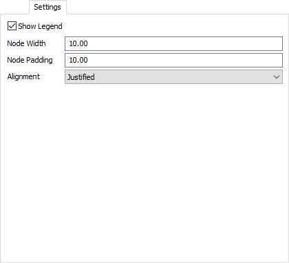
The settings tab has the following properties:
- Show Legend - Check this box to show the legend. Clear the box to hide the legend.
- Node Width - Specify the width of each node (represented as a rectangle) in the diagram. This value should be greater than zero.
- Node Padding - Specify the vertical space between nodes. This value should be greater than zero
- Alignment - Specify which alignment used for the chart
layout. There are four possible options:
- Justified - Nodes without incoming links are pushed to the left edge. Nodes without outgoing links are pushed to the right edge.
- Left - Nodes without incoming links are pushed to the left edge. Nodes without outgoing links are moved as far to the left as possible.
- Right - Nodes without incoming links are pushed as far to the right as possible. Nodes without outgoing links are pushed to the right edge.
- Centered - Nodes without incoming links are pushed as far to the right as possible. Nodes without outgoing links are pushed as far to the left as possible.
The Text Tab
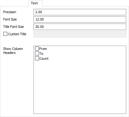
The text tab has the following properties:
- Precision - Specify the precision to use for the x axis, and for tooltips.
- Font Size - Set the font size for general text on this chart in pixels.
- Title Font Size - Set the font size for the chart title, as well as axis titles (if present), in pixels.
- Custom Title - If checked, the chart will show this property's value as the chart title. You can use this property to specify a title with special characters, or to specify that no title should be shown.
- Show Column Headers - This list allows you to specify which values, if that value is written as text on the chart, should include the column header for that value. For example, if you have a Type column, you might want the chart to show "Type: " before any type values are written.
The Colors Tab
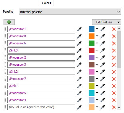
For all charts that use colors, the Colors tab allows you to choose which Color Palette the chart uses. In addition, you can configure the colors and values for that palette. For more information on Color Palettes, see the Color Palette topic.
Performance Measures
The Sankey Diagram provides two performance measures per node in the chart: the total value going in to the node, and the total value exiting the node.