Box Plot
Overview and Key Concepts
The Box Plot allows you to make boxplots (also called box-and-whisker plots) using data from a Statistics Collector:
Data Format
At a minimum, the box plot requires a table with a single column, where each row contains a value that should counted in one of the boxes. However, you can use additional columns to categorize each data point by color and/or by axis.
For example, the table below has three columns:
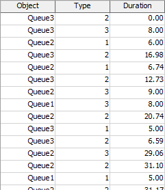
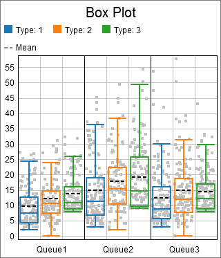
The data used to create the box plot is found in the Duration column. The other two columns are used to categorize each point. The chart shown at the beginning of this section categorized points first by the value in the Object column, then by the value in the Type column. Each unique Object column value adds an additional x axis category, and each unique Type value adds a unqiue color.
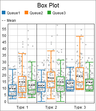
Given the table shown above, you could use the Type column to determine the axis, and the Queue column to determine the color. The resulting chart might look like the following:
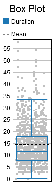
Alternatively, you could choose to ignore any categorizing values, to get a feel for the overall distribution. If you used the previous table to make a box plot without categorizing any points, it might look like the following:
Calculations
For the lines that form the center box, they are drawn at the first quartile, the median, and the third quartile. The whiskers are drawn to the first data point that is less than 1.5 * IQR (inter-quartile range) away from either the first or third quartiles.
The mean and the confidence intervals (if shown) are calculated using all data, including data outside the whisker range.
The Data Tab
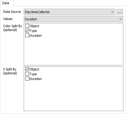
The data tab has the following properties:
- Data Source - Choose a valid data source from the drop down list. All Statistics Collectors and Calculated Tables are shown. You can also choose the last option to create a new Statistics Collector. You can click the accompanying button to open the properties window for the selected data source.
- Value Column - Choose a column from the data source that contains the values you wish to analyze using the boxplot. This column should only contain numeric data.
- Color Split By - Optional. These columns are used to categorize each data point by color. Each unique combination of values in the list becomes a new category, and each category is marked with a different color.
- X Split By - Optional. These columns are used to categorize each data point by axis. Each unique combination of values in the list becomes a new category, and each category is shown on a different part of the x axis.
The Settings Tab
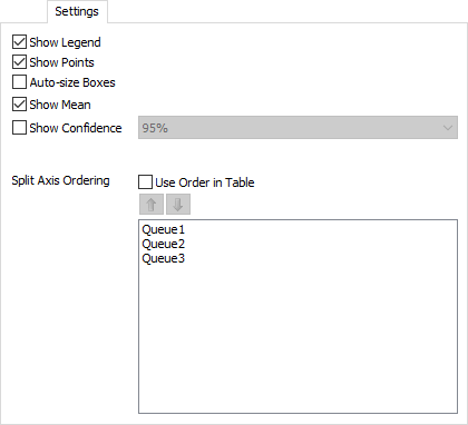
The settings tab has the following properties:
- Show Legend - Check this box to show the legend. Clear the box to hide the legend.
- Show Points - Check this box to show the data points used to generate the box plot. If this box is checked, the points will be drawn in the category color, while the box plot will be drawn gray.
- Auto-size Boxes - Check this box to adjust the width of each box, making it more proportional to the height. Clear this box to have all boxes be equally wide.
- Show Mean - Check this box to show the mean of the values on the chart.
- Show Confidence - Check this box to show the range of the confidence interval about the mean. You can use the combobox to choose the level of confidence.
- Split Axis Ordering - This property controls the order of each x axis category. If you check the Use Order in Table box, the chart will sequence the x axis categories to match the order found in the table. If the box is cleared, the chart will use the ordering given in the list. You can reorder the list using the up and down arrows.
The Text Tab
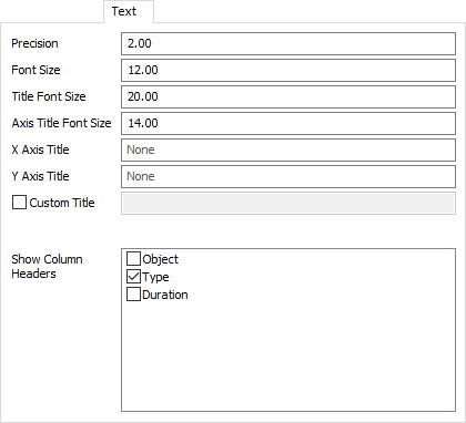
The text tab has the following properties:
- Precision - Specify the number of decimals to use on the chart. Note that this will only apply to text for floating point values.
- Font Size - Set the font size for general text on this chart in pixels.
- Title Font Size - Set the font size for the chart title in pixels.
- Axis Title Font Size - Set the font size for the axis titles in pixels.
- X Axis Title - Optional. Specify the text for the x-axis title.
- Y Axis Title - Optional. Specify the text for the y-axis title.
- Custom Title - If checked, the chart will show this property's value as the chart title. You can use this property to specify a title with special characters, or to specify that no title should be shown.
- Show Column Headers - This list allows you to specify which values, if that value is written as text on the chart, should include the column header for that value. For example, if you have a Type column, you might want the chart to show "Type: " before any type values are written.
The Colors Tab
This tab is identical to the Time Plot Colors tab. For more information, see Time Plot Colors.
Performance Measures
The Box Plot provides performance measures that aggregate the data in the column specified by the Value Column property. The chart will always provide the Average, Minimum, or Maximum of that column as a performance measure. If the either the Axis Categories or the Color Categories columns are specified, the chart will allow you to obtain the Average, Minimum, or Maximum of the value column, filtering by a specific category.