Time Plot
Overview and Key Concepts
The time plot chart allows you to create line charts, stair-step charts, and scatter plots.
Data Format
At a minimum, the time plot requires a table to have at least two columns: one column that contains an x value, and another that contains a y value. Each row identifies a unique point. If there are additional columns in the table, you can use them to categorize each point. Each point can be categorized by color, as well as by axis.
For example, the table below has four columns:
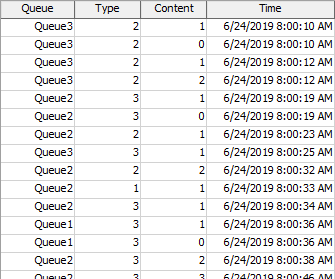
The data for the x values are found in the Time column, and the data for the y values are found in the Content column. Each row defines a single point, with the given x and y value.
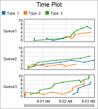
The other columns are used to categorize each point. The chart shown at the beginning of this section categorized points first by the value in the Queue column, then by the value in the Type column. Each unique Queue column value adds an additional axis, and each unique Type value adds a unique color.
Given the table shown above, you could use the Type column to determine which axis to put the point on, and the Queue column to determine what color the point should be. If you did, the chart might look as follows:
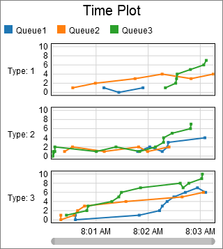
The two plots shown previously display the same data points, but they are categorized into different axis groups, and into different color groups.
Performance Measures
The Time Plot provides aggregations of the Y Values column as performance measures. Possible aggregations include:
- Average
- Sum
- Minimum
- Maximum
- Last Value
- Time-Weighted Average
If any columns are marked as Split By columns, then for each unique split-by value, the chart will provide the same aggregations, but filtered exclusively for the split-by value.
Properties Panels
The Time Plot uses the following properties panels: