Histogram
Overview and Key Concepts
The histogram allows you to create a histogram of a set of data. Histograms are useful for showing the distribution of a set of values.
Data Format
At a minimum, the histogram requires a table with a single column, where each row contains a value that should counted in one of the histogram's buckets. However, you can use additional columns to categorize each data point by color and/or by axis.
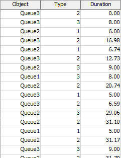
For example, the table below has three columns:
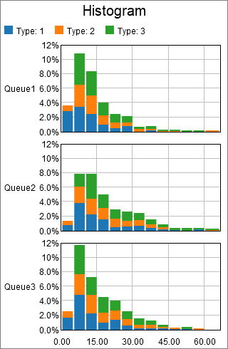
The data used to create the histogram is found in the Duration column. The other two columns are used to categorize each point. The chart shown at the beginning of this section categorized points first by the value in the Object column, then by the value in the Type column. Each unique Object column value adds an additional axis, and each unique Type value adds a unqiue color.
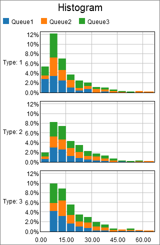
Given the table shown above, you could use the Type column to determine the axis, and the Queue column to determine the color. The resulting chart might look like the following:
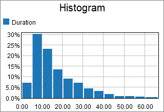
Alternatively, you could choose to ignore any categorizing values, to get a feel for the overall distribution. If you used the previous table to make a histogram without categorizing any points, it might look like the following:
Performance Measures
The Histogram provides performance measures based on aggregations of the Values column, including the Average, Sum, Minimum, and Maximum. In addition, if some columns are marked as Split-by columns, the chart will provide the same aggregations for each unique combination of Split-by values.
Properties Panels
The Histogram uses the following properties panels: