Key Concepts About Dashboards and Charts
Overview of Dashboards and Charts
Dashboards are a blank window pane that you can customize with anything that you need to access during a simulation run. The most common purpose for using a dashboard is to display charts. Charts can display statistics and visually represent data from a statistics collector. They are actually updated in real time while your simulation model is running.
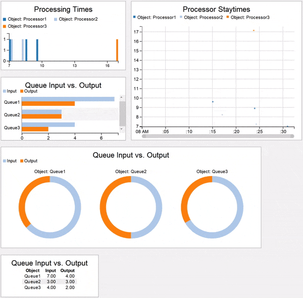
In addition to displaying charts, dashboards can also include other types of model displays such as the date and time or model documentation.
Types of Dashboard Content
When you open a dashboard, you'll notice that the Library changes to display various dashboard widgets. There are four categories of widgets, which are explained in more detail in the following sections:
Charts
The first set of widgets in the library are the basic all-purpose charts:
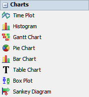
These charts don't make any assumptions about what kinds of data you want to collect other than how you want to visualize that data. If you use these types of charts, you'll need to connect those charts to any objects or tools such as data collectors on your own. For that reason, these basic charts are typically used by more advanced users. See Types of Charts for a more detailed explanation of how each type of chart visualizes data.
Chart Templates
The next five sets of widgets are the chart templates (with the following image only showing a portion of the available chart templates):
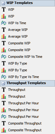
Chart templates are intended to help you create commonly needed statistics in a quick, easy, and user-friendly manner. You should select a chart based on the types of statistics you're interested in and how you want to visualize the data.
When you use a chart template, you'll be able to specify the objects from which you would like to gather statistics. When you drag one of the charts to the dashboard and set up its basic properties, the chart will auto-generate the necessary tools that are needed for that statistical task (statistics collectors, calculated tables, groups, etc.). However, these tools will remain hidden in the background unless you install them in your simulation model.
General
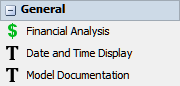
You can use the general widgets to display general information about the model such as the model's current date and time, custom financial data, or model documentation to explain the model to stakeholders.
Model Inputs
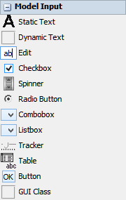
Custom model inputs allow you to change certain variables in the model to see how they affect the results of a simulation run. Model inputs allow you to build a custom control panel that you can use to modify variables in the simulation model before each run. For example, you could build model inputs that control flow item arrival times, processing times, or the number of operators in a model.
Typically model inputs are only used by advanced simulation modelers that are handing off the model to stakeholders or to users who are not authorized to change the simulation model itself. Model inputs make it possible for users who are not familiar with FlexSim to control and get information from a simulation model without directly editing the model itself. Building model inputs will be explained in more detail in a forthcoming chapter in the User Manual about creating presentations.
Best Practices When Working With Charts
The following sections provide a few general guidelines for working with charts in FlexSim:
Choose the Right Chart
Choosing the right chart to visualize your data will depend a lot on what kind of data you're trying to represent visually. Before choosing a chart, spend a moment and think about the nature of the data you're trying to visualize. What do you need to convey about this data? Do you need to display a single set of data or compare data from multiple objects or sources? Which objects do you want to collect data from? Will it be better to aggregate data or to show the data as it changes over time?
Use Descriptive Titles and Labels
Your charts will be more useful if they are as clear as possible. Ensure that the chart's title is descriptive and that data labels are accurate. In many cases, you might need to consider renaming objects or rows and columns in the data table in order to make your labels more accurate and user-friendly.
Types of Charts
The following table provides an overview of the charts you can use to visualize your simulation model's data:
| Chart | Explanation |
|---|---|
| Time Plot | Can display data as scatter plots, line charts, or stair step plots. These charts are best for showing values that will fluctuate over time or when you want to show a relationship between two variables using their X and Y coordinates. See Time Plot for more information. |
| Histogram | Can visualize a distribution of numerical data. These charts are ideal when you are using a random statistical distribution to introduce variability into your simulation model. These charts can display the frequency that certain numbers are generated by the distribution. It can also compare objects that are using different statistical distributions. See Histogram for more information. |
| Gantt Chart | Visualizes data in a stacked bar chart that shows the progress of items or tokens as they move through a simulation model over time. These charts are helpful for showing the staytime of items or tokens in each 3D object or activity in the model. They can also illustrate the dependency relationships between objects and activities. See Gantt Chart for more information. |
| Pie Chart | Shows each data point as a percentage compared to the whole data series. Pie charts are best for comparing sets of similar values from various objects. See Pie Chart for more information. |
| Bar Chart | Similar to a pie chart, bar charts can compare data between similar objects. Bar charts are ideal if you want to display absolute values rather than relative values. See Bar Chart for more information. |
| Table Chart | Table charts display the raw statistics for a set of data. You should choose this type of chart if you simply want to see the hard data from the model expressed in numbers or text. See Table Chart for more information. |
| Box Plot | Like histograms, box plots can visualize a distribution of numerical data. These charts are ideal when you are using a random statistical distribution to introduce variability into your simulation model. These charts can display the frequency that certain numbers are generated by the distribution. See Box Plot for more information. |
| Sankey Diagram | Sankey diagrams can visualize the flow of items from one object to another. These charts are most useful when there are two or more possible routes that an item could take to get from the beginning of one system to another. Sankey diagrams can display the amount of items that took one route as opposed to another. See Sankey Diagram for more information. |