Dashboard Widgets
Overview and Key Concepts
Dashboard widgets allow you to view and control parts of your model through a graphical interface. You can create input fields, buttons, tables and other input widgets.
Model Input Properties
The following shows the available model input properties from the Dashboard library:
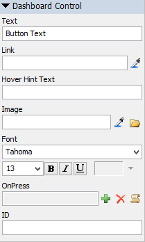
It has the following options:
Text
Specify the title or text of the control.
Available for:
- Static Text
- Checkbox
- Radio Button
- Button
Link
Specify the path to a node in the model. If the widget is an Edit or Dynamic Text, the Link can also be to a Global Variable.
Available for:
- Dynamic Text
- Edit
- Checkbox
- Radio Button
- Combobox
- Listbox
- Tracker
- Table
- Button
- GUI Class
Hover Hint Text
This text will be displayed as a tooltip when the user hovers their mouse over the control.
Available for:
- Dynamic Text
- Edit
- Checkbox
- Radio Button
- Combobox
- Listbox
- Tracker
- Button
Image
Displays an image instead of text for the control.
Available for:
- Static Text
- Button
Font
Specifies the font name, size, properties and color of the control's text (color only available for Static Text, Dynamic Text and Edit controls).
Available for:
- All (except GUI Class)
Triggers
Some model input objects have triggers that fire, allowing you to execute your own custom code. It has the following properties:
- OnPress - Fires when a button, checkbox or radio button are pressed.
- OnApply - Fires when the enter key is pressed in an edit field and when you click off of an edit field (focus is removed).
- OnDrag - Fires as a tracker is clicked/dragged
- OnSelect - Fires when an item in the combobox/listbox is selected.
ID
A Dashboard Control's ID is a string that allows you to easily reference the control through code or picklist options. Use the getdashboardcontrol() command to get a reference to the model input object (the field, button, etc).
Available for:
- All
Combobox and Listbox Options
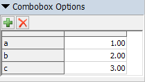
A list of items to display in the combobox/listbox drop down. Values must be numeric.
Tracker
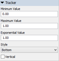
The tracker has the following properties:
- Minimum Value - The minimum value of the tracker.
- Maximum Value - The maximum value of the tracker.
- Exponential Value - Changes the distribution of values between the minimum and maximum to be exponential. Setting this value to 1 will cause the tracker to be linear.
- Style - Changes the style of the thumb button.
- Vertical - If checked, the tracker will display vertically.
Spinner
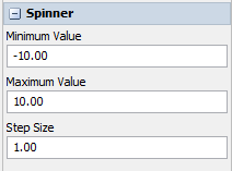
The spinner has the following properties:
- Minimum Value - The minimum value of the spinner.
- Maximum Value - The maximum value of the spinner.
- Step Size - The amount the spinner increments the value by with one click.