Box Plot
Overview and Key Concepts
The Box Plot allows you to make boxplots (also called box-and-whisker plots) using data from a Statistics Collector:
The Data Tab
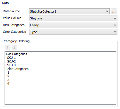
The data tab has the following properties:
- Data Source - Choose a valid data source from the drop down list. All Statistics Collectors and Calculated Tables are shown. You can also choose the last option to create a new Statistics Collector. You can click the accompanying button to open the properties window for the selected data source.
- Value Column - Choose a column from the data source that contains the values you wish to analyze using the boxplot. This column should only contain numeric data.
- Axis Categories - Optional. If specified, the data in the specified column will be used to categorize the values in the value column. Each category will be drawn individually, and labelled on the x-axis.
- Color Categories - Optional. If specified, the data in the specified column will be used to categorize the values in the value column. Each category will be drawin individually, in a different color.
- Category Ordering- Shows a list, which you can reorder, of the various categories found in either the Axis Category column, the Color Category column, or both.
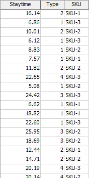
The chart assumes that the data table will have one row per value to include in the box plot. The value for each point can be found in the column specified by the Value Column option. Any category values should be found in the same row. For example, the following table shows the first few rows of data used for the example images in this topic:
The Axis Categories and the Color Categories options can be used separately, together, or not at all. The following table shows the result of the above data, with different combinations of those options:
| Options | Possible Result |
|---|---|
| No axis or color categories specified | 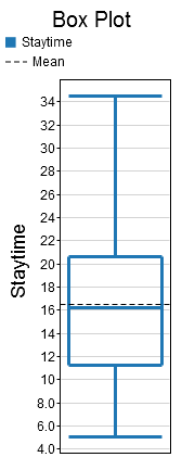 |
| Specify the SKU column for the Axis Categories option | 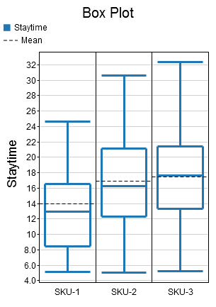 |
| Specify the Type column for the Color Categories option | 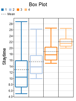 |
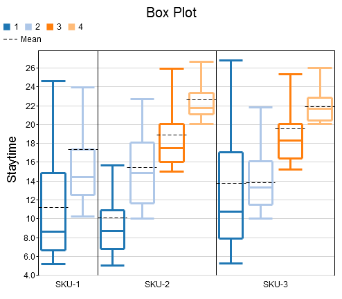
| Specify the SKU column for the Axis Categories option, and the Type column for the the Color Categories option. | |
The Settings Tab
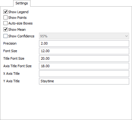
The settings tab has the following properties:
- Show Legend - Check this box to show the legend. Clear the box to hide the legend.
- Show Points - Check this box to show the data points used to generate the box plot. If this box is checked, the points will be drawn in the category color, while the box plot will be drawn gray.
- Auto-size Boxes - Check this box to adjust the width of each box, making it more proportional to the height. Clear this box to have all boxes be equally wide.
- Show Mean - Check this box to show the mean of the values on the chart.
- Show Confidence - Check this box to show the range of the confidence interval about the mean. You can use the combobox to choose the level of confidence.
- Precision - Specify how many significant digits to use on the y-axis, and in the hover text.
- Font Size - Specify the font size to use for the axis labels, and for the hover text.
- Title Font Size - Specify the font size for the chart title.
- Axis Title Font Size - Specify the font size to use for the axis titles.
- X Axis Title - Specify the name of the x axis
- Y Axis Title - Specify the name of the y axis
The Colors Tab
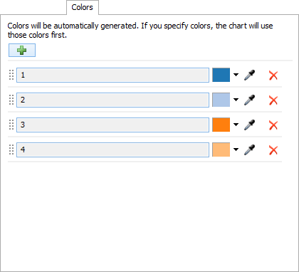
This tab allows you to specify the colors for each line on the chart. Each category of data will get a new color, based on the Color Categories option. As more colors are required, the chart will generate a color and assign color to a category. Once this is done, you can change the color for each color. Alternatively, you can add colors to the chart, before the colors are required. The chart will use the specified colors, assigning them to a category, before generating new colors.
The colors tab has the following properties:
- Add Color
 - Allows
you to add additional colors to the chart.
- Allows
you to add additional colors to the chart.
- Color List - This list shows what colors the chart is using, and what categories they are assigned to. You can use the dropdown arrow or the sampler button to choose a new color for each category. If the Color Categories option is set to None, then there will only be one color shown. Otherwise, there will be one color per unique value in the Color Categories column.
Performance Measures
The Box Plot provides performance measures that aggregate the data in the column specified by the Value Column property. The chart will always provide the Average, Minimum, or Maximum of that column as a performance measure. If the either the Axis Categories or the Color Categories columns are specified, the chart will allow you to obtain the Average, Minimum, or Maximum of the value column, filtering by a specific category.